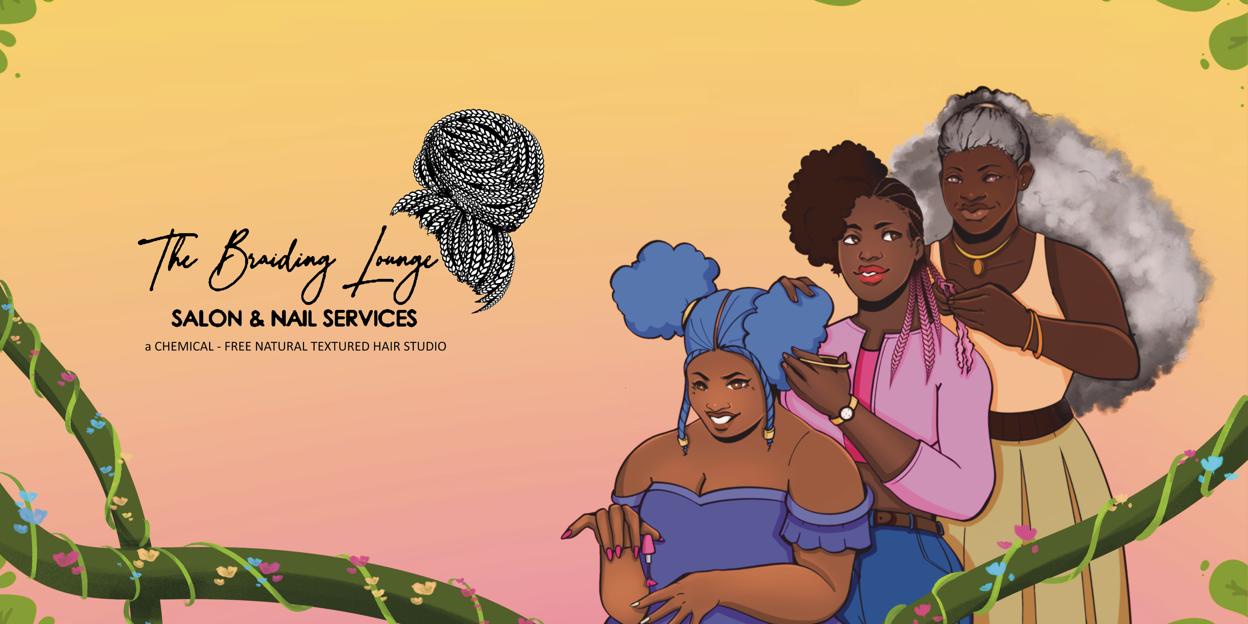
The Braiding Lounge Salon
Brand Design • Iconography • Illustration
Role
Timeline
Visual Systems Designer
Tools
September 2022 - Present
Client
Figma, Procreate
The Braiding Lounge Salon & Nail Services
Overview
The Braiding Lounge is a Halifax-based braiding salon specializing in protetive styles and textured hair care. For its opening, I designed illustrations for decorative use.
As the business expanded its digital prescence and marketing materials, its original identity began to create usability and scalability challenges.
I led a brand identity refresh focused on improving clarity flecibility, and cross-platform consistency while preserving the brand’s existing visual equity.

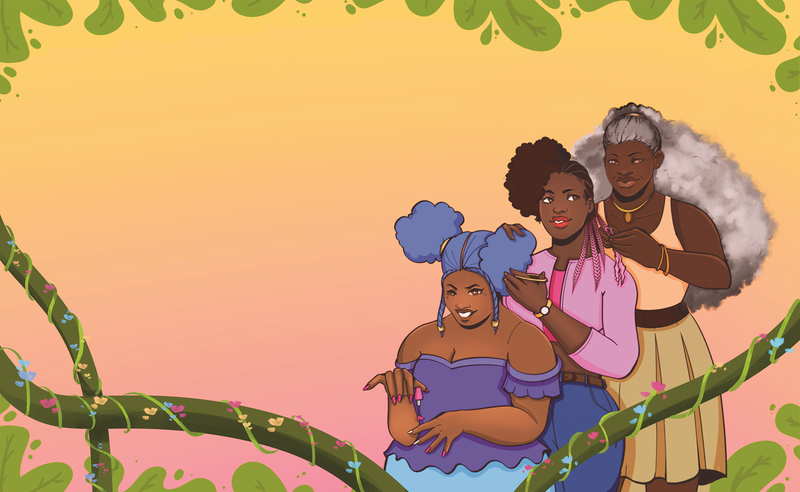
Salon Illustrations
I was commissioned to design a few illustrations for the salon opening in 2022, which incuded a mural and decals for decoration.
Illustrated mural for the salon interior reception desk.
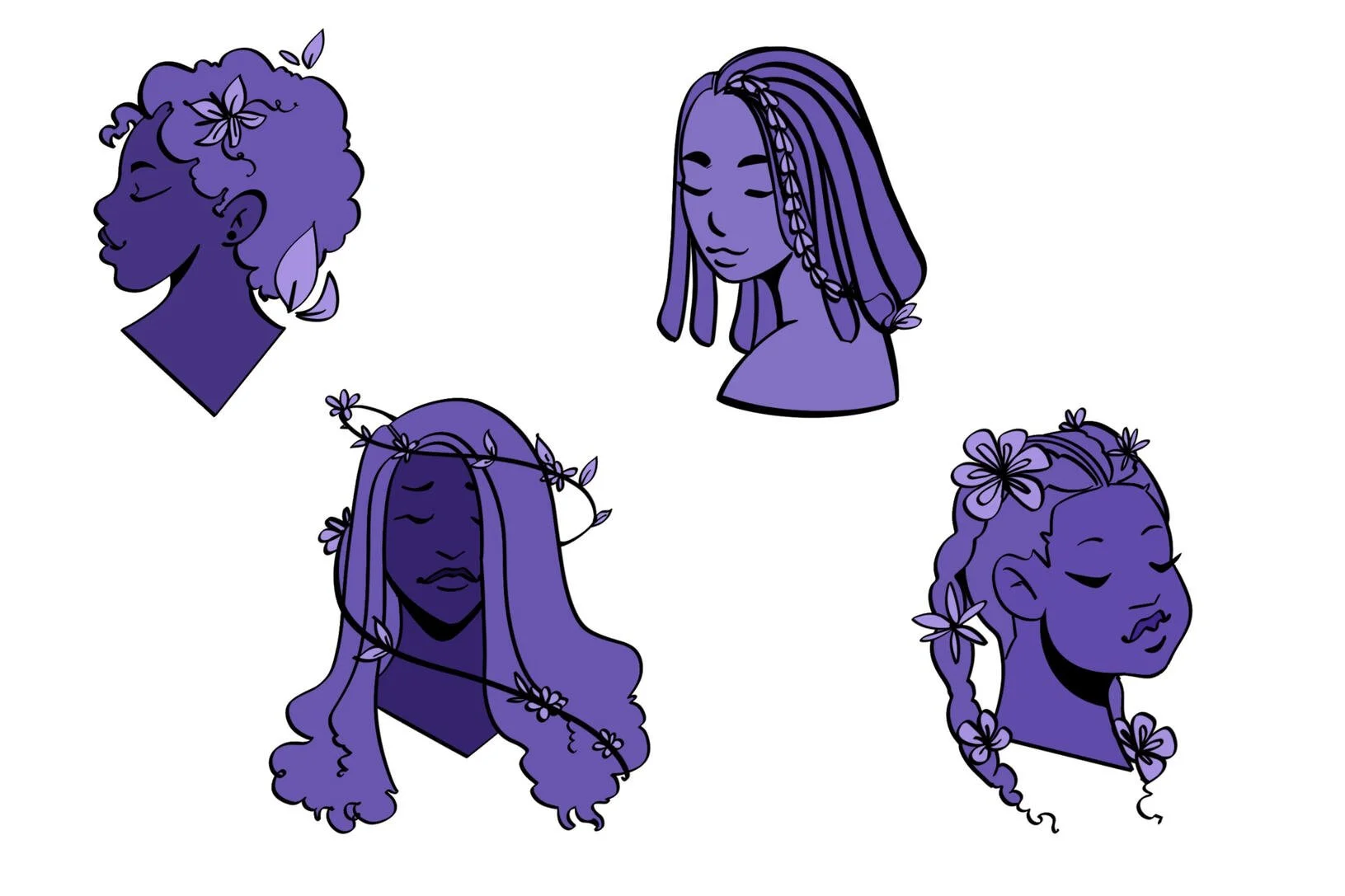
Illustrated decals for the salon interior walls.
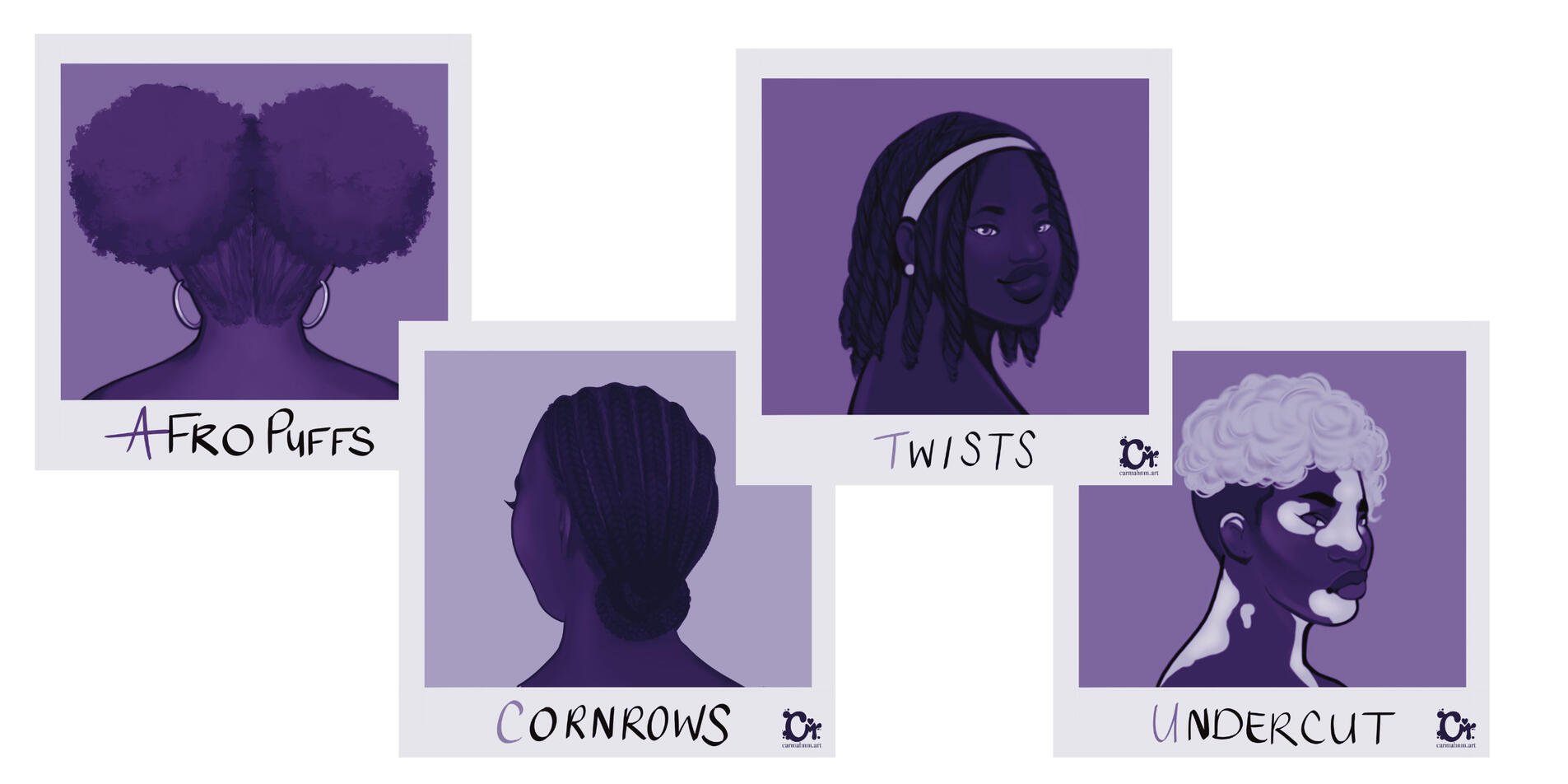
Illustrated decals for the salon exterior windows.
Re-design Context
The original logo was expessive, but operationally limiting:
High detail reduced leibility at small sizes
Icon placement required over scaling to remain visible
Single-orientation layout restricted usage
Lack of typography system created inconsistencies
As a result, the brand lacked flexibility across web, print, social media, and merchandise.
The identity functioned as a graphic, not a system.
Goals:
Improve scalability and legibility
Create a flexible multi-orientation logo suite
Develop a reusable supporting graphic system
Establish consistent typography hierarchy
Elevate overall visual polish while maintaining brand familiarity
Design Approach
Rather than fully discarding existing elements in the rebrand, I focused on refinement and systemization. The new mark retains the original hairstyle concept, but simplifies the illustration into a clean, vector-based form, inspired by the existing decals in the salon.
The design process prioritized:
Modular logo contruction
Clear spacing rules
Small scale legibility
Cross-format adaptibility
Reduced visual noise
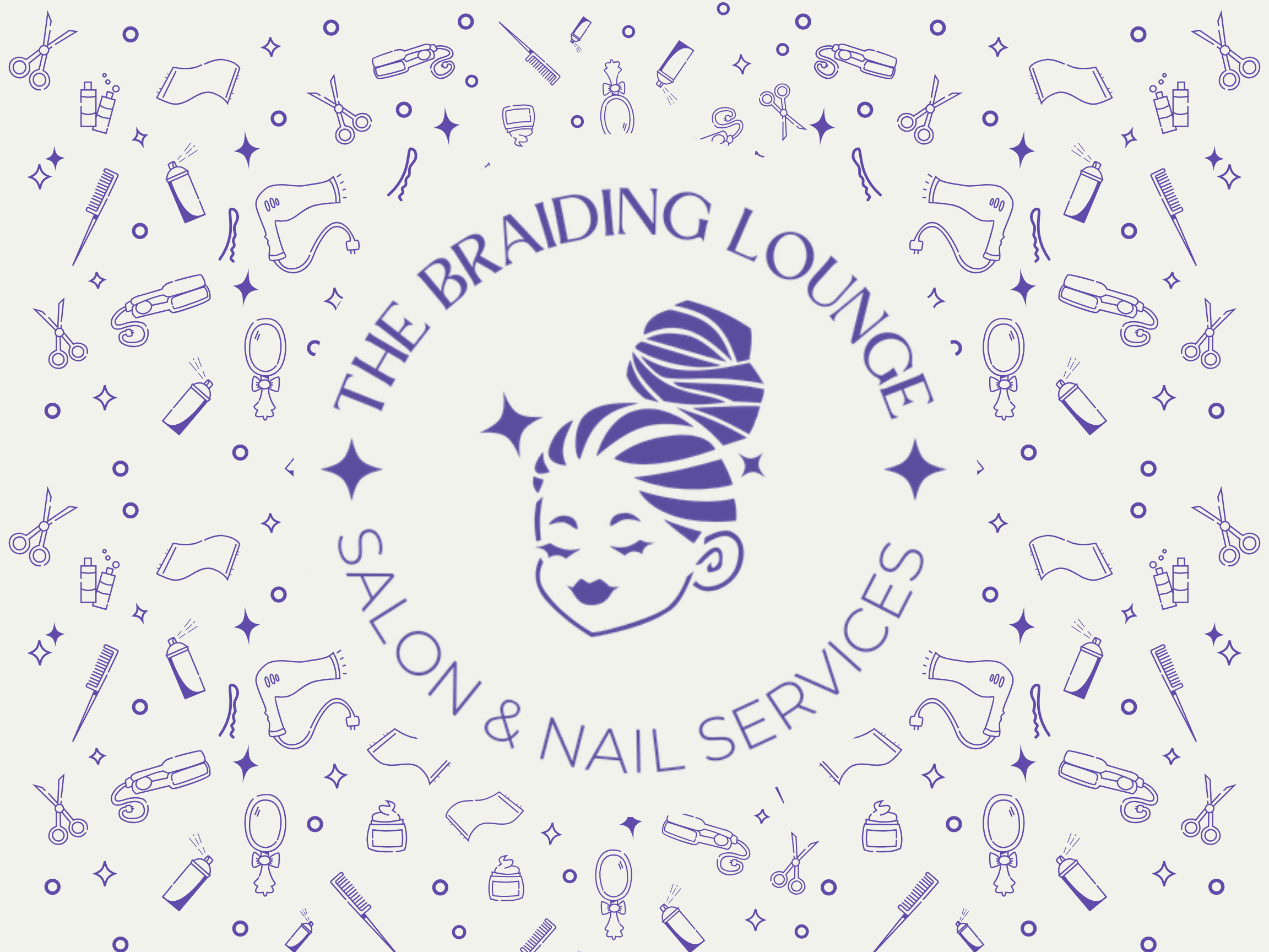
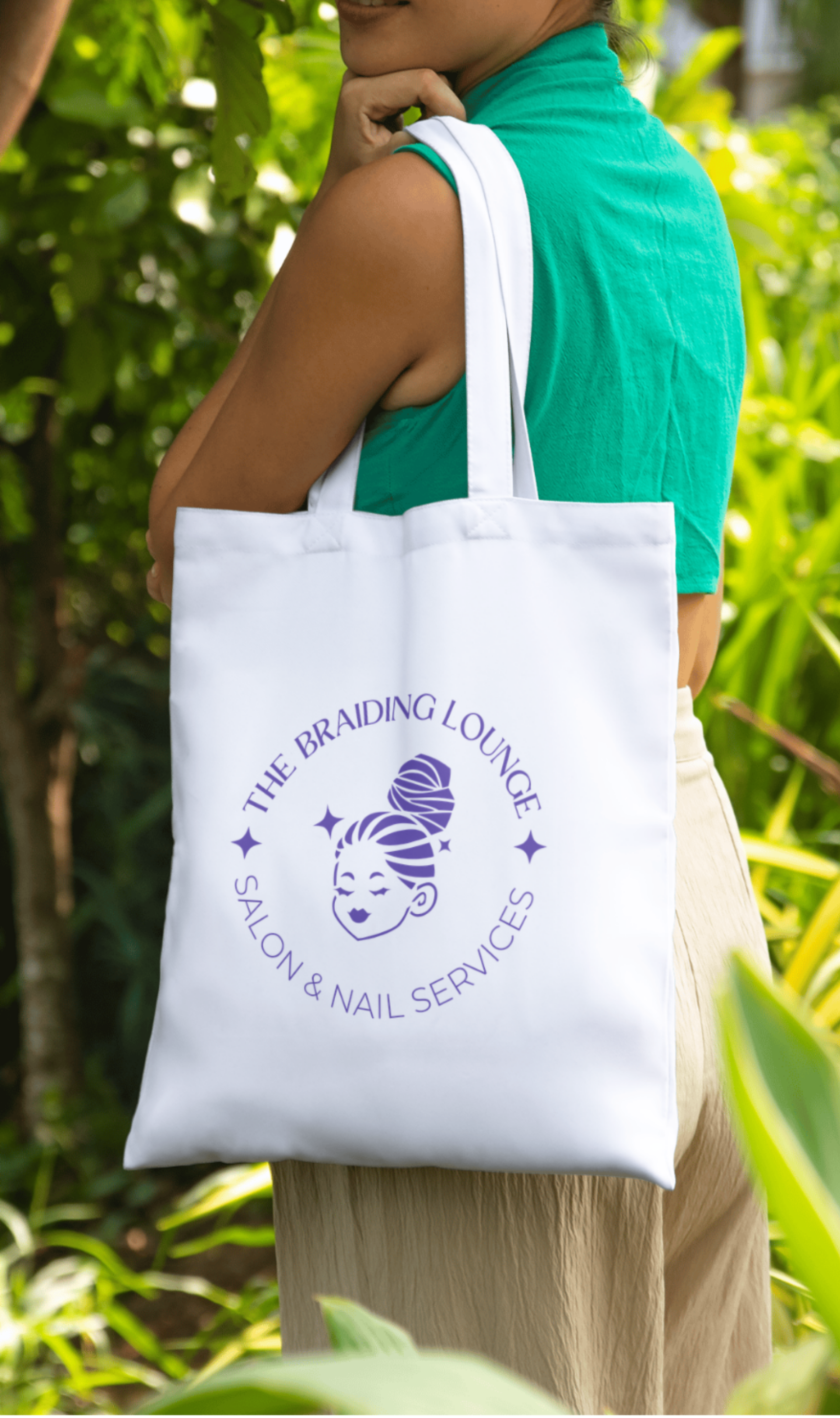
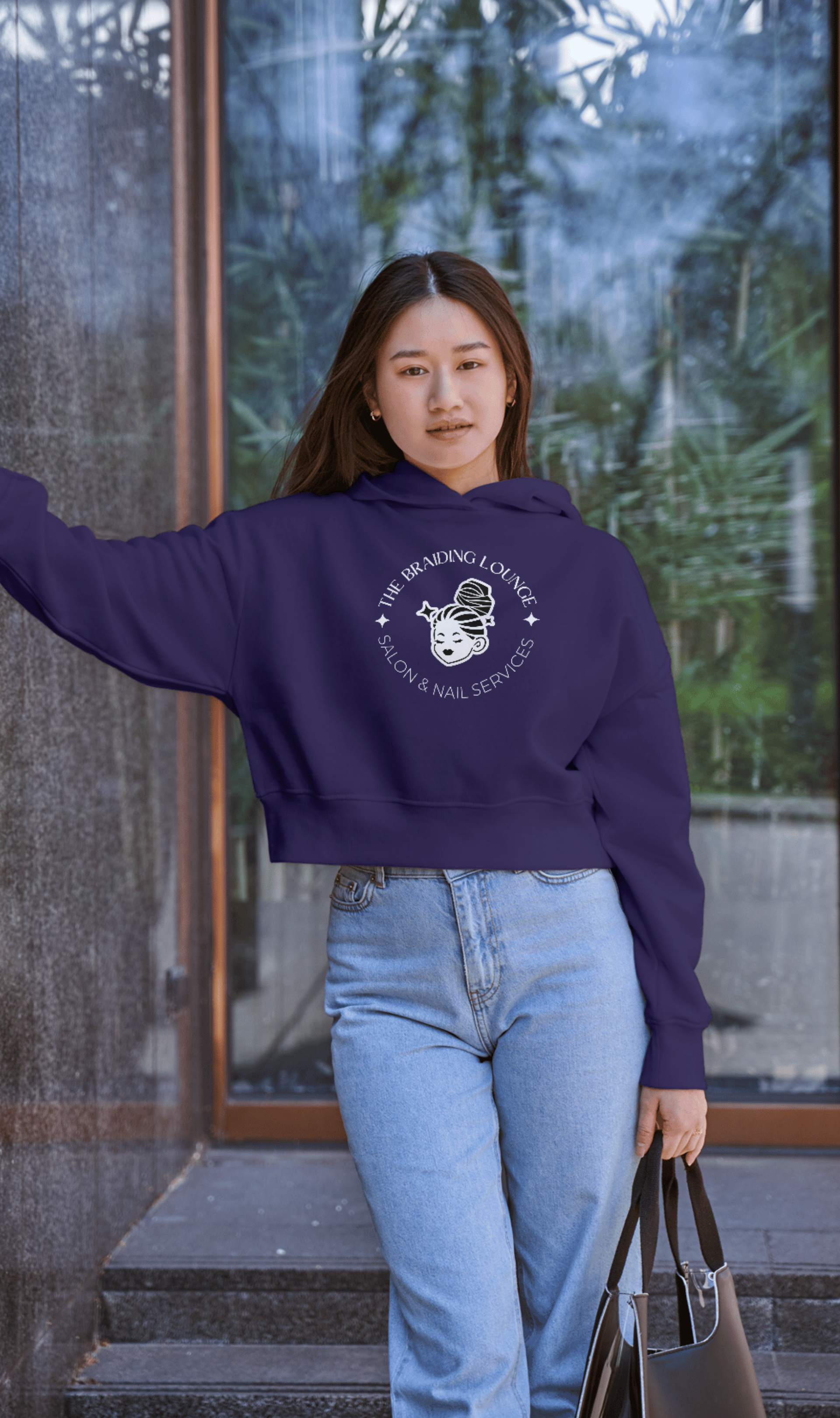
Logo System
This structure ensures the brand can function across different constraints, without distortion.

Pimary (Horizontal): Designed for website headers, signage, etc.

Secondary (Vertical): Optimized for square and stacked layouts, like social media posts and print materials.

Badge: Used for promotional materials, stickers, and event applications.

Icon: A simplified standalone mark that remains legible at small sizes (favicon, profile images, packaging)
Supporting Visual System
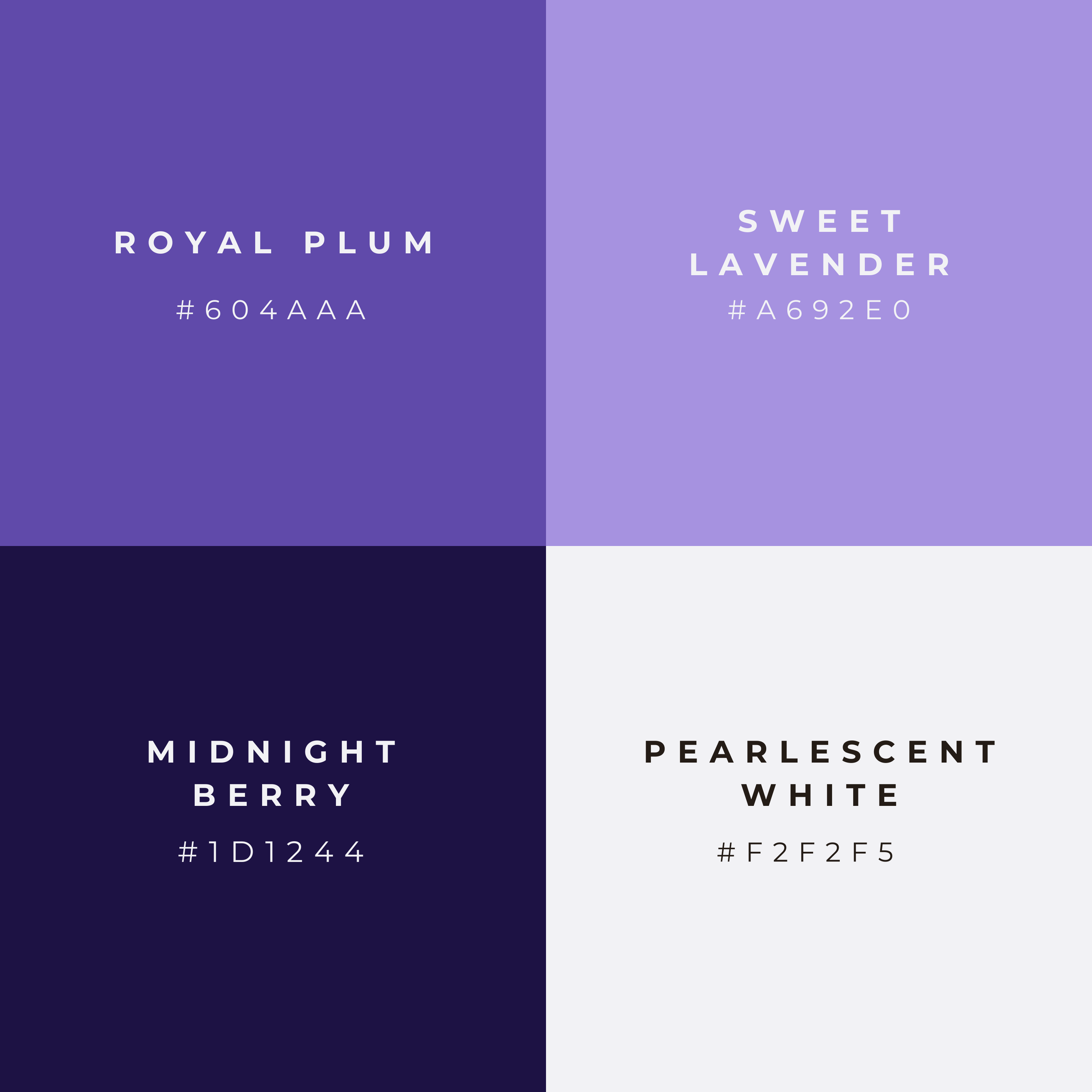
Color Strategy
The refreshed color palette centers around rich purple tones to elevte brand perception and differentiate from common salon aesthetics (e.g. black and gold).
Neutral supporting tones were introduced to ensure contrast accessiblity and layout flexibility.
Colors:
Royal Plum | #604AA
Sweet Lavender | #A692E0
Midnight Berry | #1D1244
Pearlescent White | #F2FF5
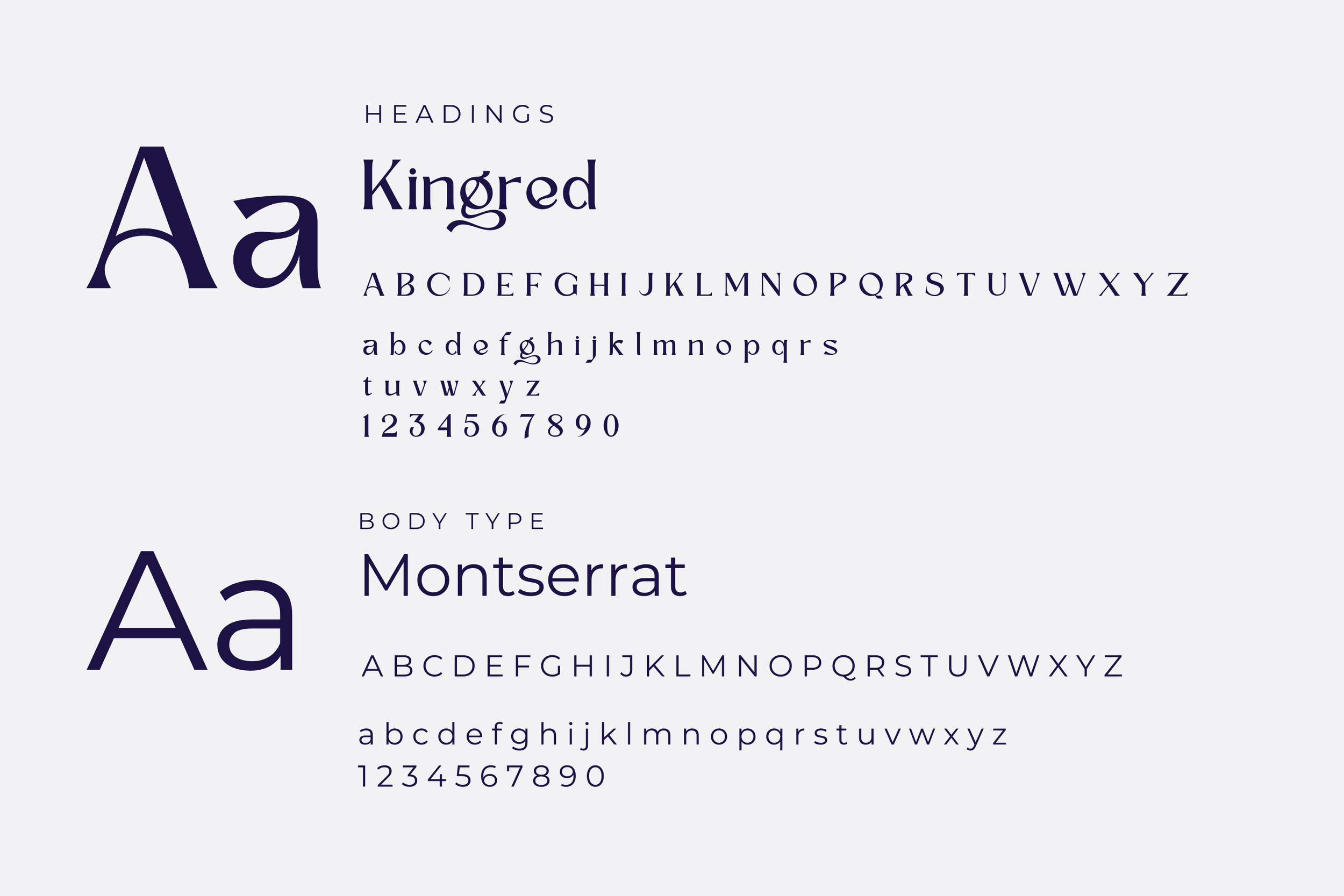
Typography
A structured type hierarchy was introduced:
Kingred: Headers and brand-forward statements. The crossbars in some of the consonants emulate the curve ove the braid in the logo.
Montserrat: Body text and supporting content. Chosen for legibility and simple style.
This pairing balances personality with clarity, improving readability across digital and print applications.
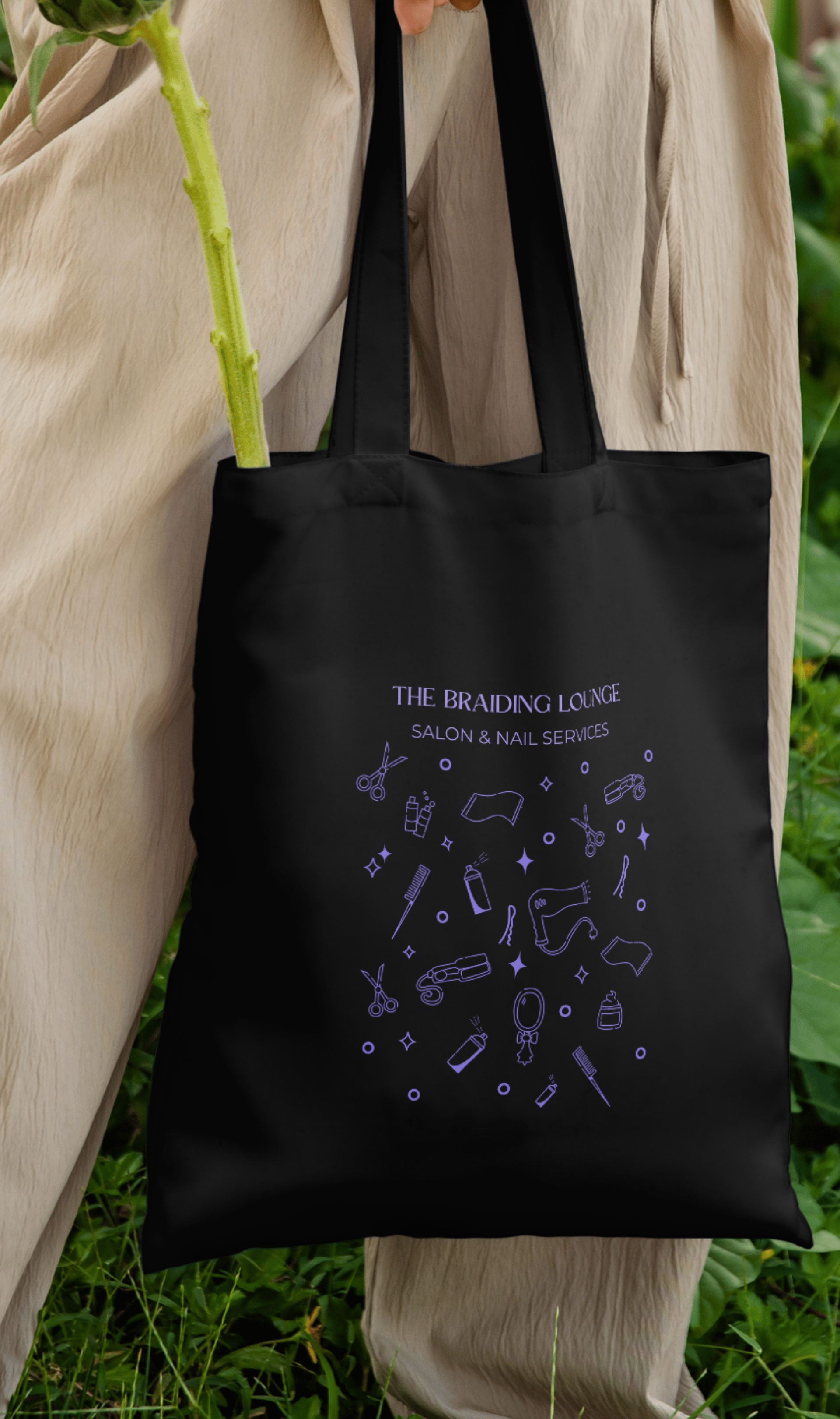
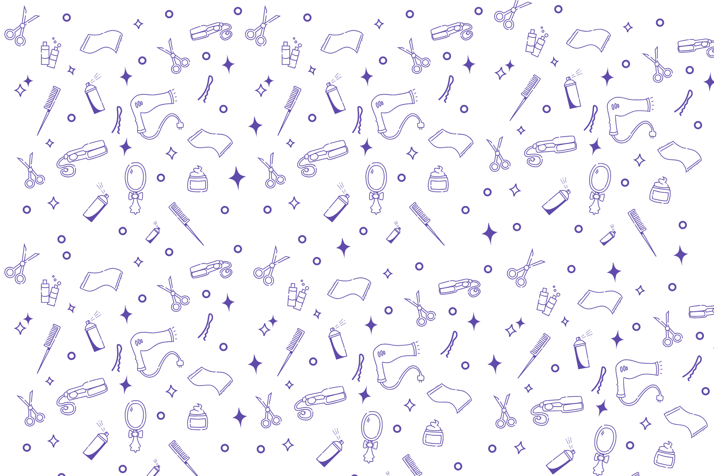
Iconography
To extend the identity beyond the logo, I developed a custom icon set composed of 10 salon-related tools: scissors, hairdryer, comb, hairspray, shampoo, pin, gel, flat iron, towel, & mirror. These icons form a repeatable pattern system used for:
Background textures
Social graphics
Packaging
Promotional materials

Results
The refreshed identity is now:
Scalable
Legible at all sizes
Flexible across formats
Visually cohesive
Easier to apply consistently
The Braiding Lounge Salon now has a visual system that preserved the original heart of the brand, while enabling long-term growth and adaptability.
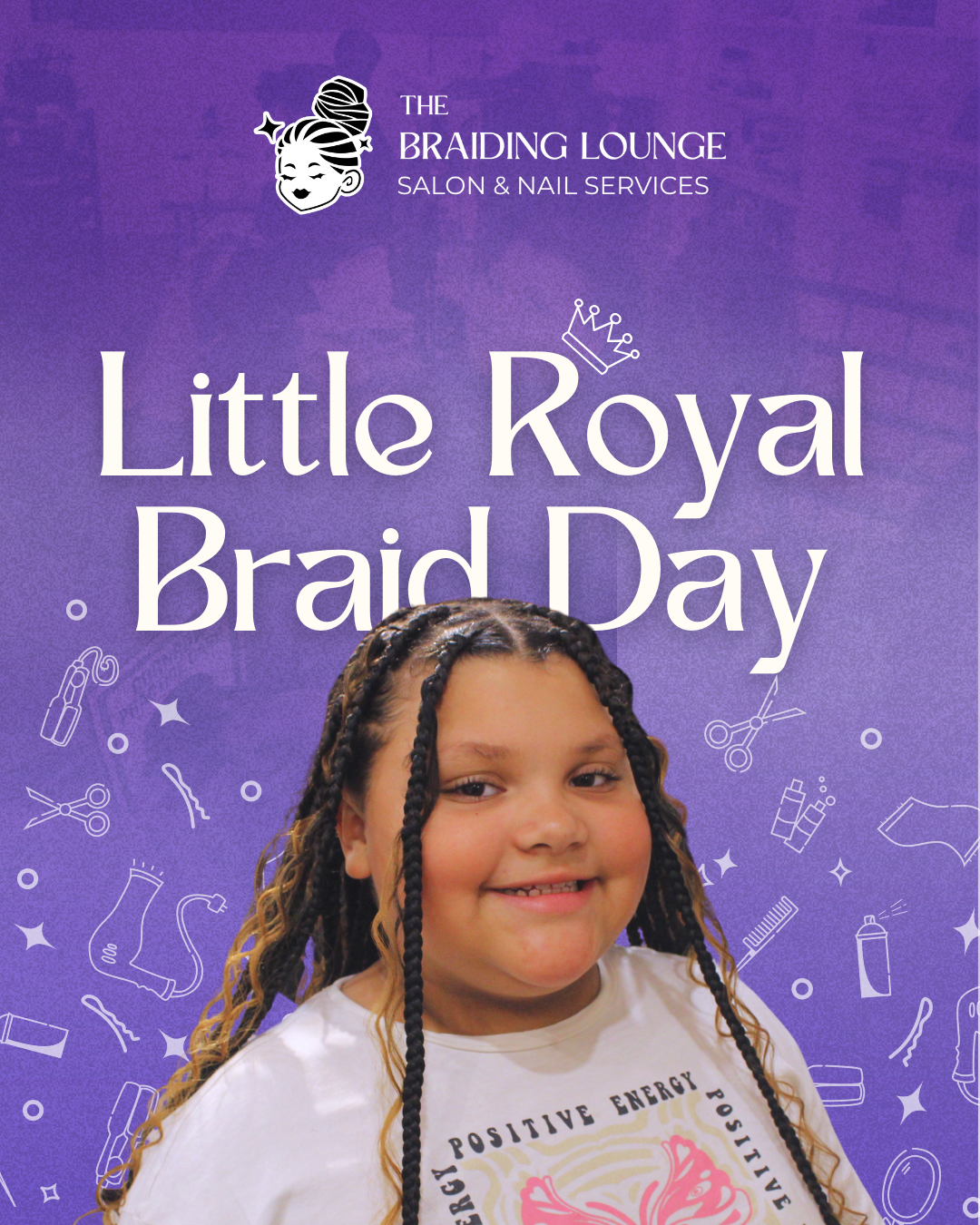
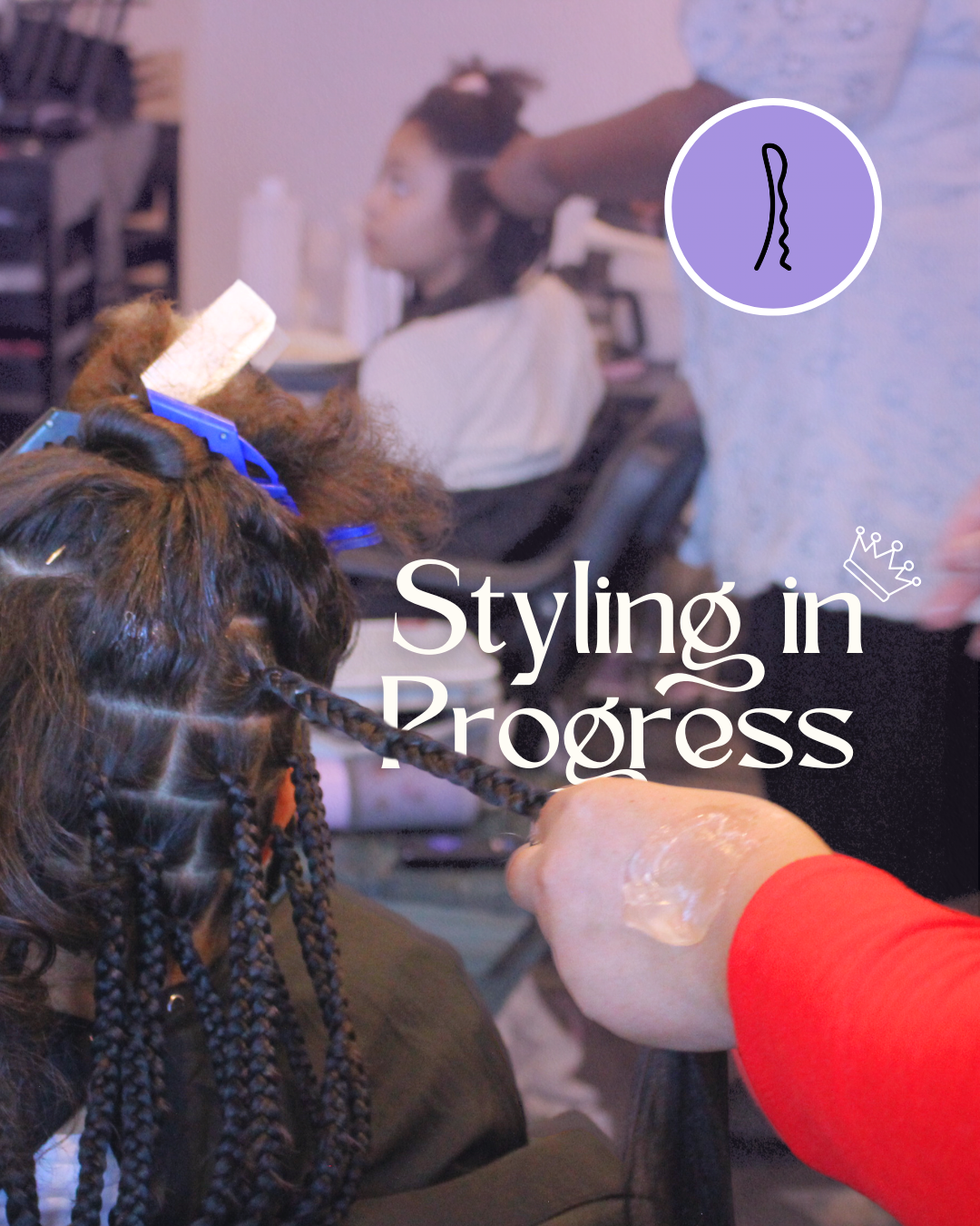
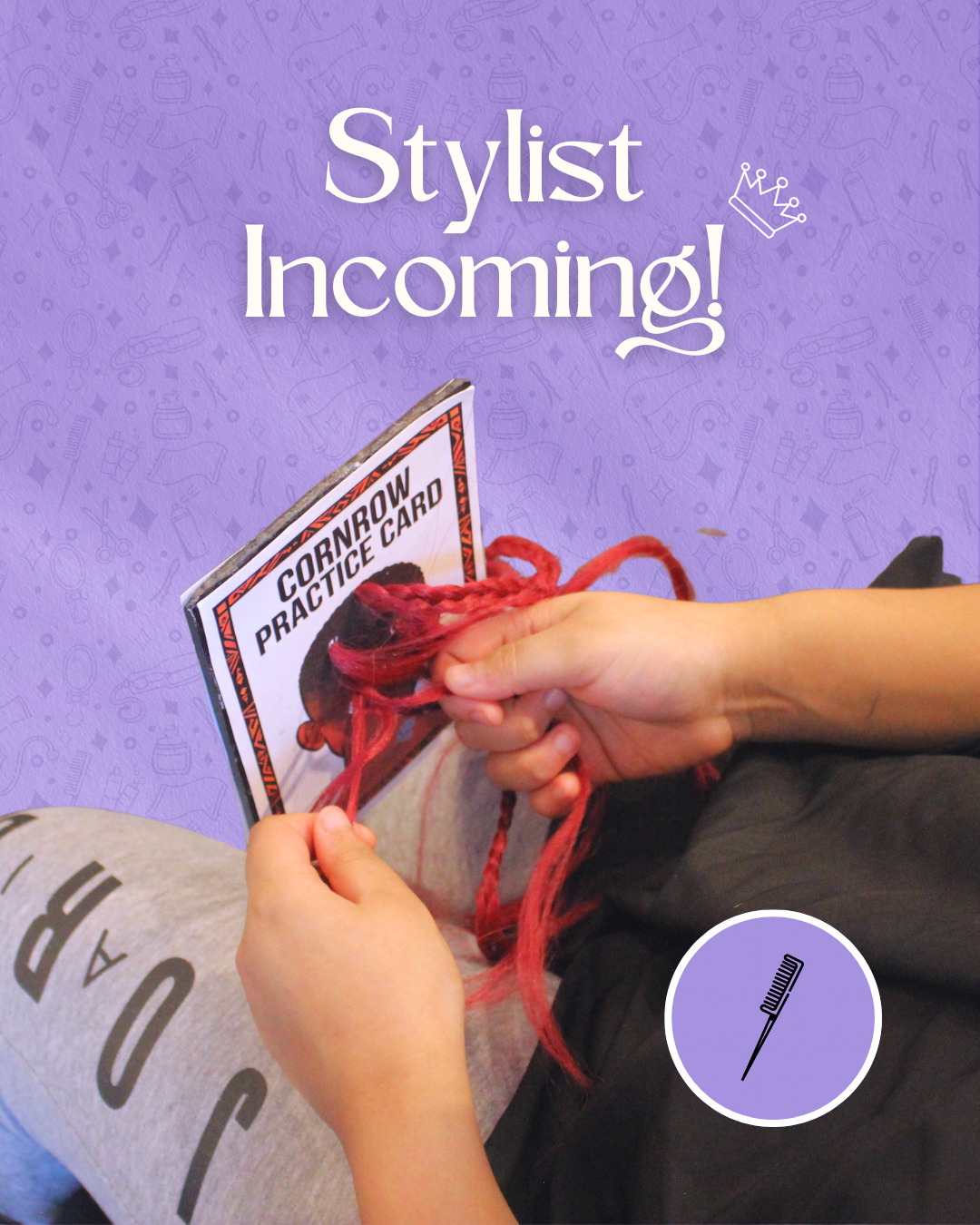
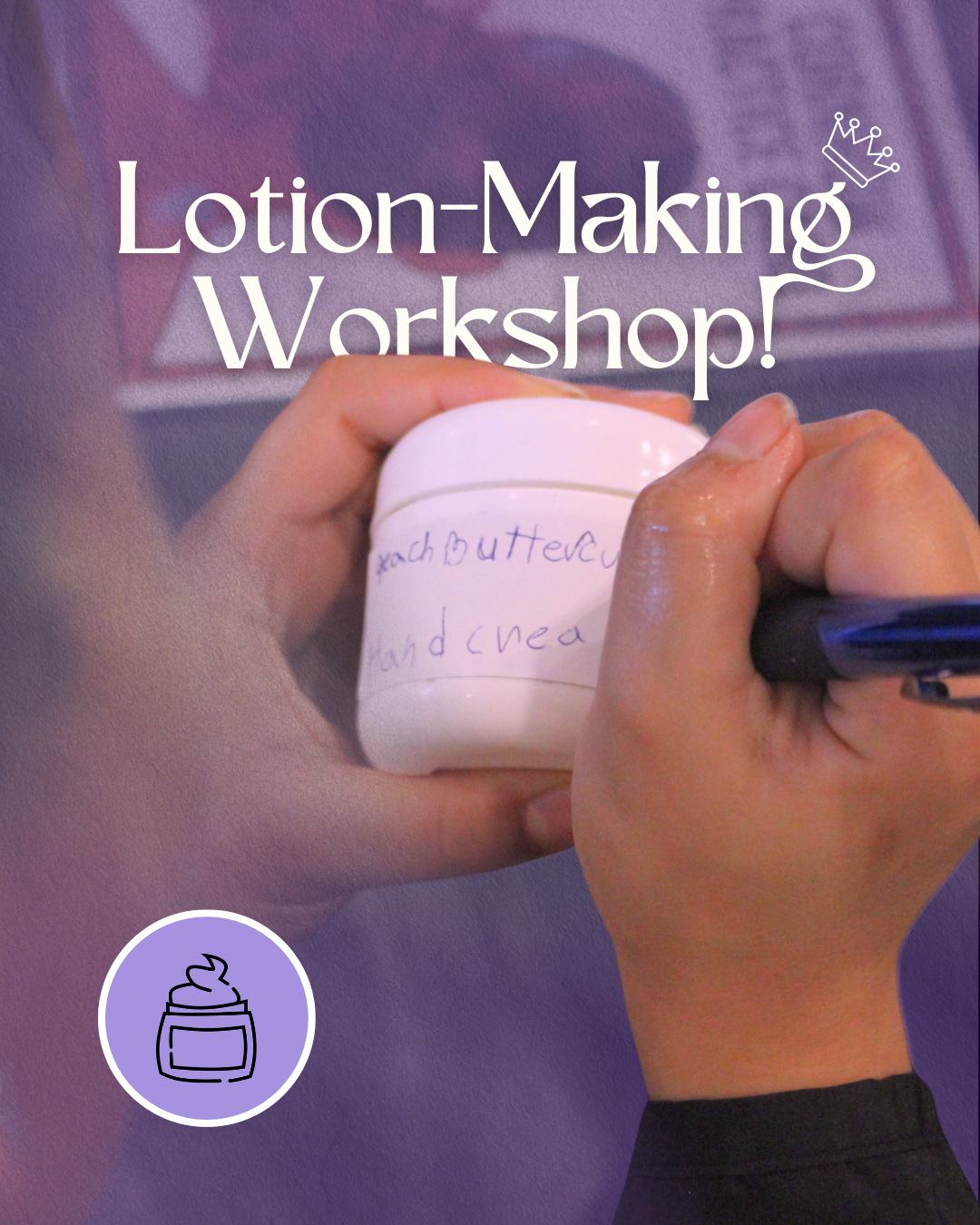
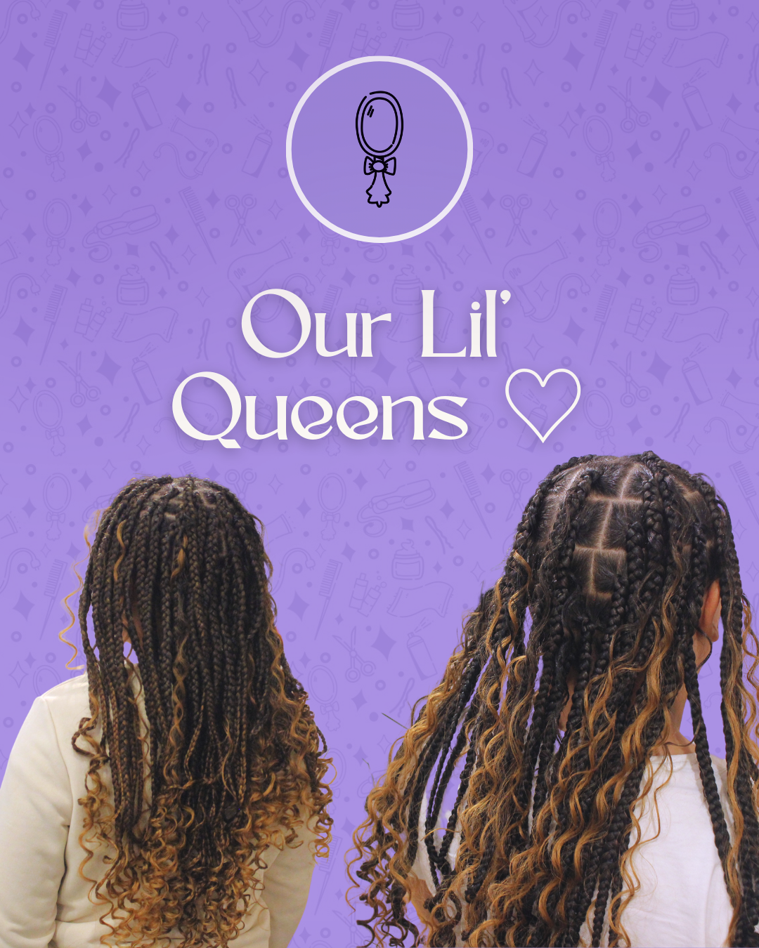
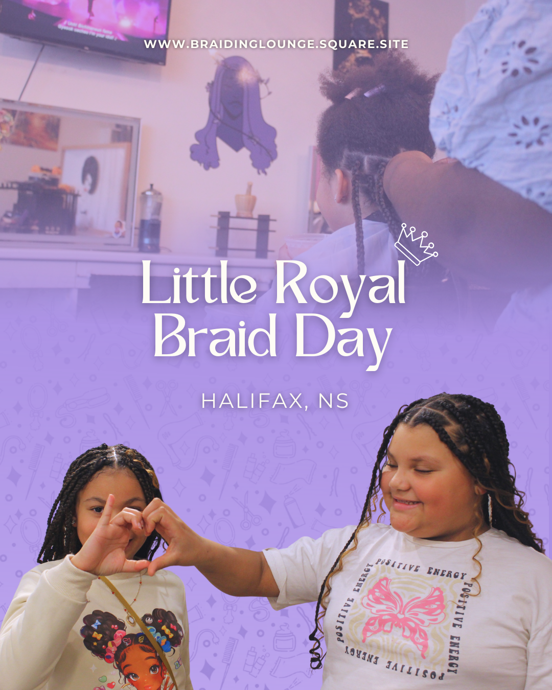
Social Media Post using the new branding.