
WolfRaven Wellness
Web Design & Devlopment • Brand Identity
Role
Timeline
Web & Brand Designer
Tools
April - November 2025
Client
Figma, Notion, Procreate
WolfRaven Wellness
WolfRaven Wellness is an Indigenous-owned practice offering trauma-informed massage therapy, mobile massage, and Cultivating Safe Spaces (CSS) workshops for organizations.
Rooted in decolonial care and relational healing, the practice supports individuals and groups in learning to regulate the nervous system and build inclusive, safe environments.
Problem Statement
The original website was built using a Square Inc. template meant for booking services, but it lacked warmth, structure, and identity. The logo didn’t convey uniqueness, and the visuals didn’t align with the deep, relational tone of WolfRaven’s work.
Key issues included:
Inconsistent web design elements
Limited mobile functionality
No distinct brand identity
Sparse copy and missing context for trauma-informed practice
Objectives
Create a cohesive brand identity and website that reflects WolfRaven’s decolonial, trauma-informed values
Highlight two core offerings: Massage Therapy and Cultivating Safe Spaces Workshops
Improve accessibility, structure, and flow for both clients and organizations
Build a system the founder could easily update during maternity leave
My Role
I led the rebrand and full website redesign, including:
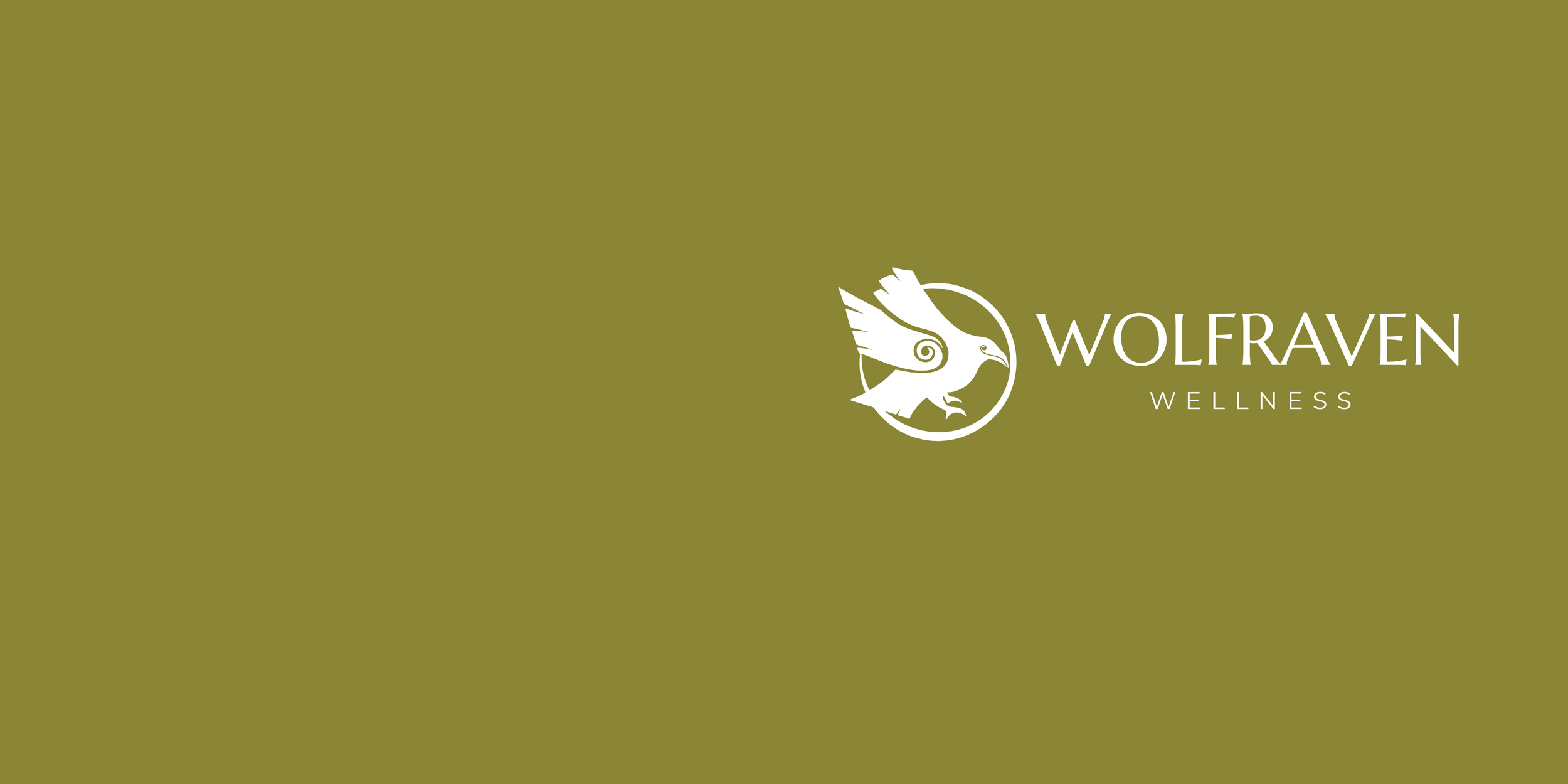
Logo redesign and complete logo suite (icon, wordmark, stacked, horizontal, and square versions)
Typography system using Marcellus (headings) and Montserrat (body) for a balance of warmth and clarity
Style guide and brand color palette inspired by nature: soft golds, warm browns, and earthy greens
UX research and sitemap design based on reference sites (Dr. Scherina and Mana Temple)
UI design and full build in Squarespace
SEO setup, mobile optimization, and alt text for accessibility
Domain transfer and launch prep
1. Discovery & Brand Redesign
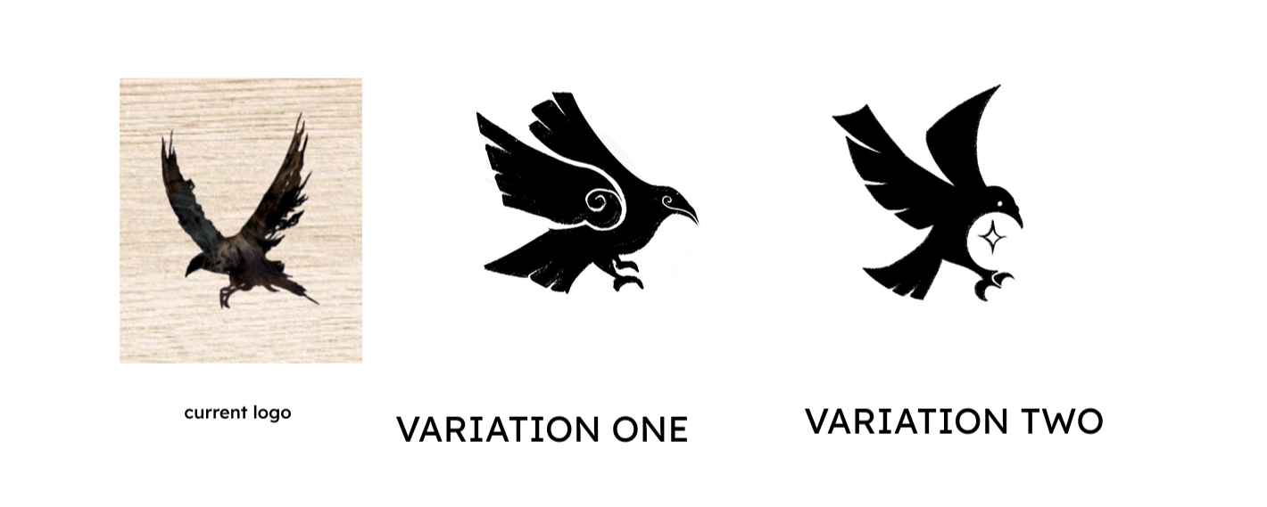
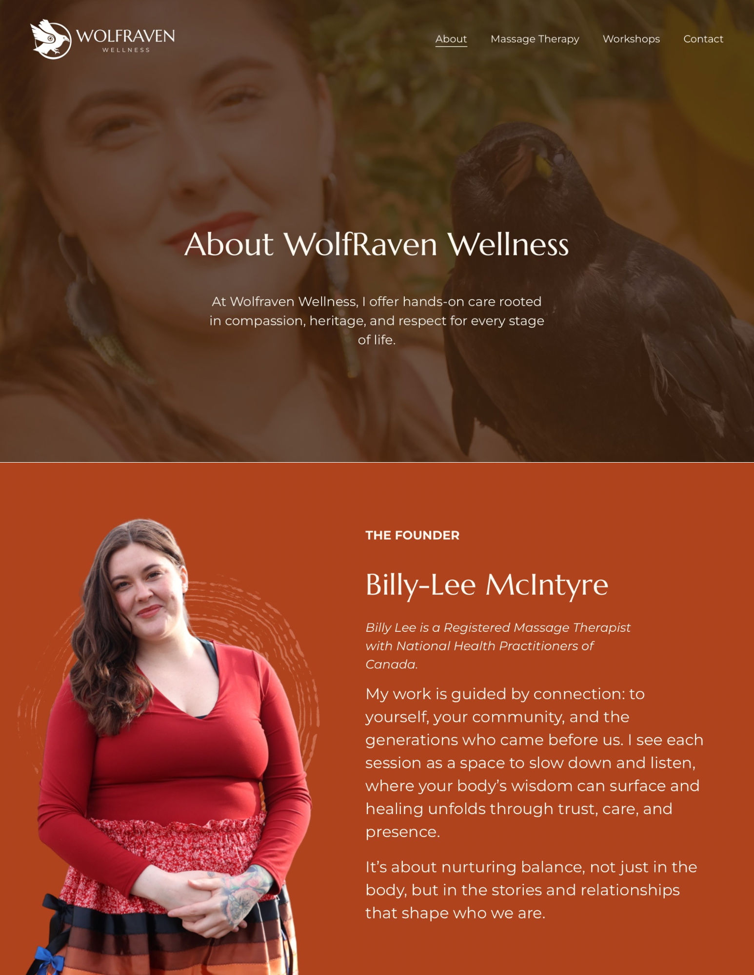
We began by grounding the visual identity in WolfRaven’s values: care, connection, and cultural rootedness. I provided two logo variations that echoed the original design. After discussing what imagery Billy-Lee felt reflected her business, I redesigned the raven logo into a flat illustration, and graphic devices featuring organic tree-ring swirls: symbolizing growth, cycles, and nature.
The supporting palette and typography aimed to feel calm, earthy, and professional, mirroring the decolonial and feminine energy of the brand.
2. UX Research & Information Architecture
Through user flow mapping, I organized content into clear pathways for two main audiences:
Clients booking massage therapy sessions
Organizations seeking workshops or consulting
I analyzed other wellness sites that the client liked, to understand how they balanced personal storytelling with service clarity. Then I built out a structure that lets visitors quickly identify services, explore educational content, and book or inquire with minimal friction.
3. Copy Development & Content Design
While the client provided base text & guidelines, I edited and expanded the copy to sound more grounded around trauma-informed language. The goal was to make every page feel like an open invitation rather than a sales pitch.
Each section now tells a story: “Meet Billy-Lee” highlights personal roots, “Massage Therapy” focuses on care and regulation, and “Cultivating Safe Spaces” explains the relational leadership framework in approachable terms.
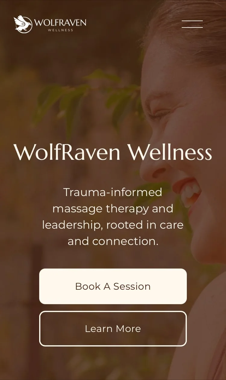
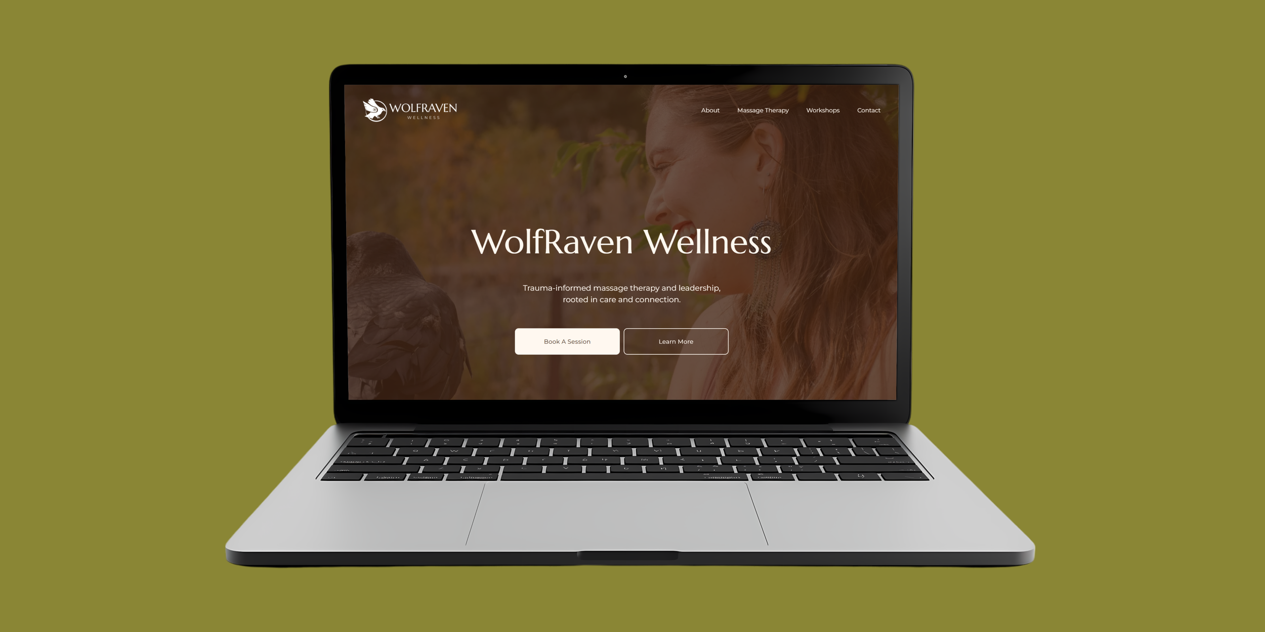
4. Web Design & Build
The final site was designed and built in Squarespace using custom layout blocks and graphics that carried over the circular tree-ring motif.
Key improvements:
Visual hierarchy: clear headlines, calm whitespace, and intuitive navigation
Mobile-first design: fully responsive across all devices
SEO optimization: keyworded titles, metadata, and accessibility alt text
Calls to action: gentle but clear booking prompts on every page
Solution
The new design introduced:
A multi-page structure with clear navigation.
A professional and cohesive visual identity.
Optimized metadata, headings, and alt text for improved SEO and accessibility.
Readable, well-structured layouts with visual hierarchy and consistent formatting.
Results & Key Takeaways
The new WolfRaven Wellness site now reflects the founder’s mission through cohesive branding, intentional storytelling, and a grounded, decolonial aesthetic.
Although the site is currently in final revisions and will launch publicly once the founder returns from maternity leave, the transformation from template to identity-driven experience is already complete.
Visitors can:
✔ Differentiate between the two service areas
✔ Learn about trauma-informed care through visual storytelling
✔ Easily book a session or workshop
Additionally:
✔ The new sitemap and SEO optimizations increased search accuracy and indexing potential.
✔ Unified fonts, color palette, and image treatments strengthened brand identity.
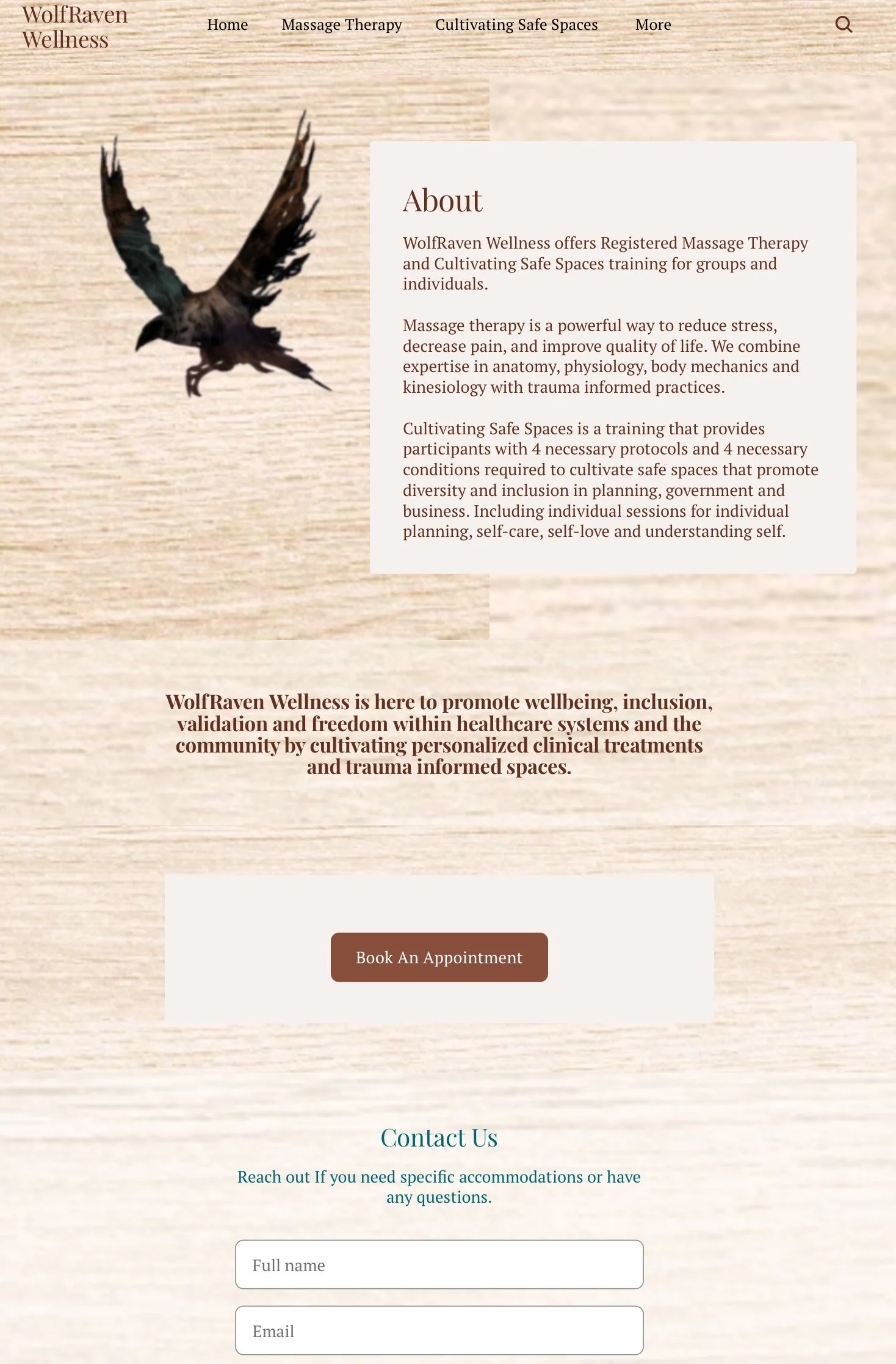
Original Homepage Design
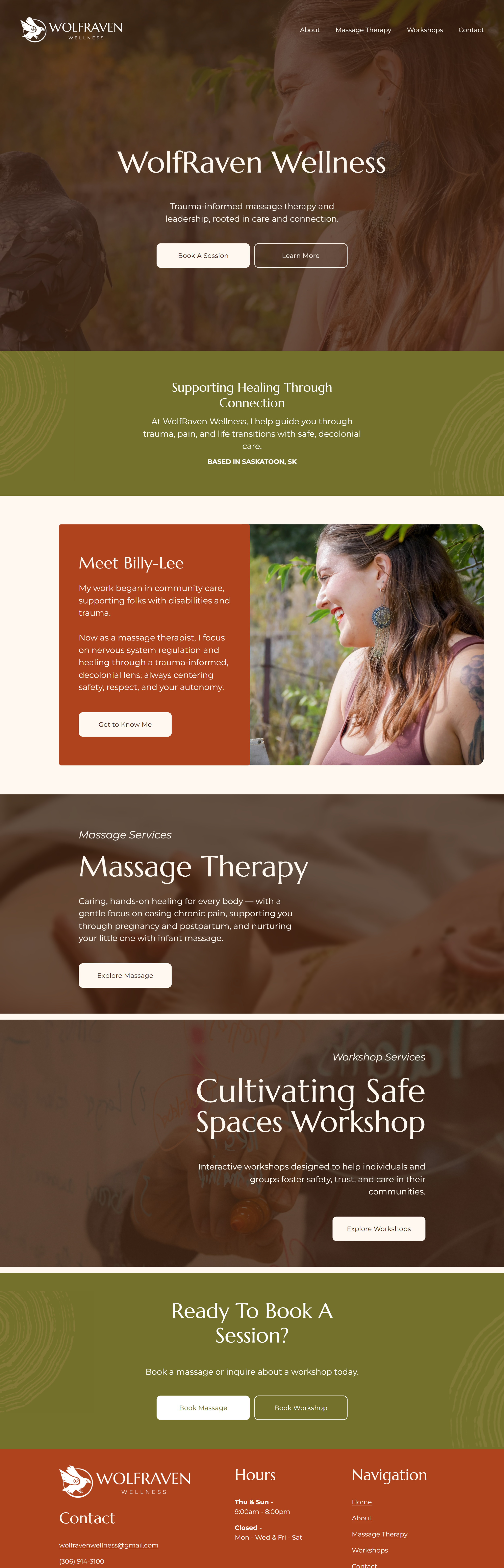
New Homepage Design

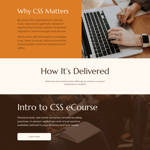
New Workshop Page Design