
InterCHANGE
Outdoor Gallery
Illustration • Graphic Design
Role
Timeline
Illustrator, Graphic Designer
Tools
June - September 2025
Client
Procreate, Figma
IOTA Studios & Halifax Regional Municipality

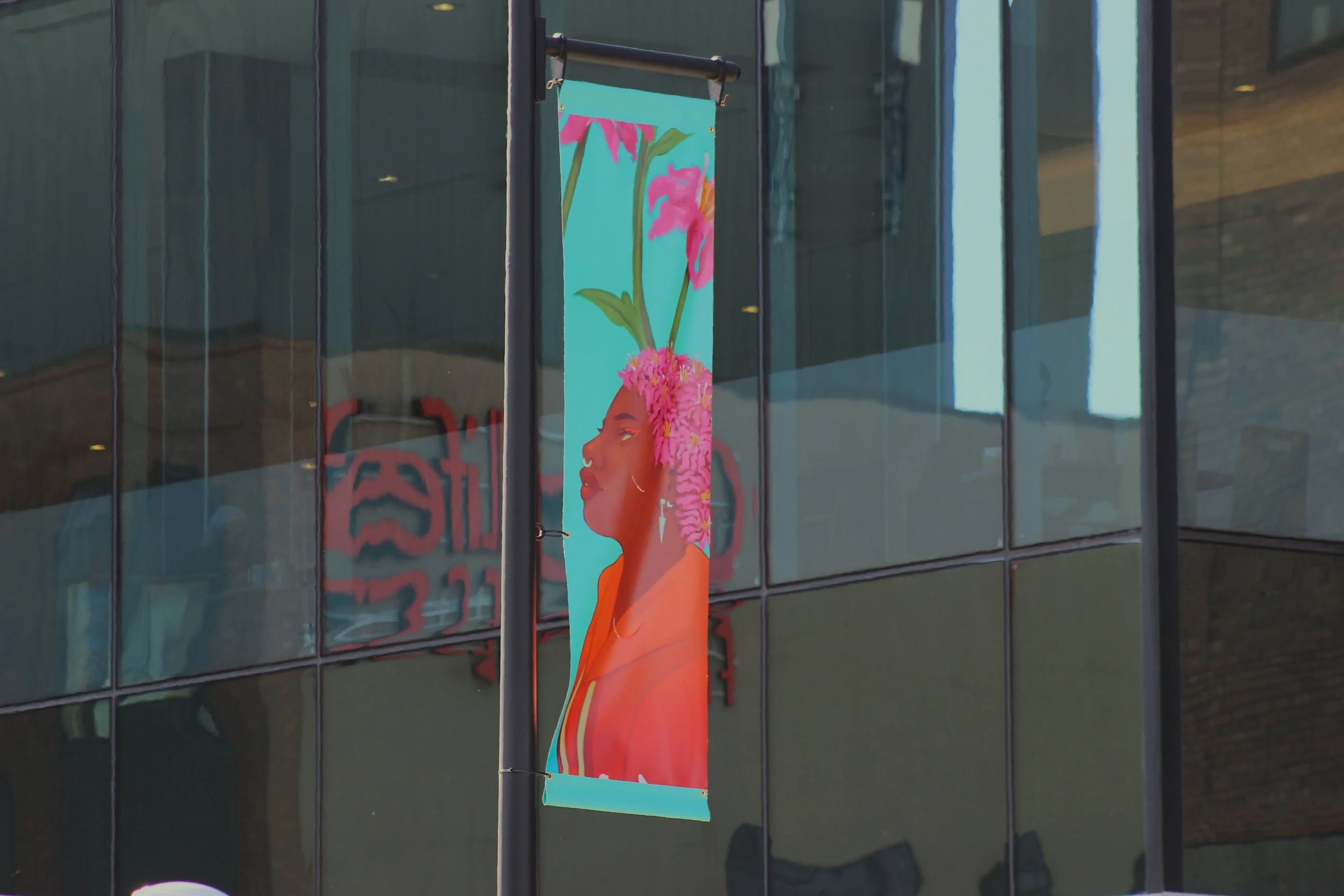
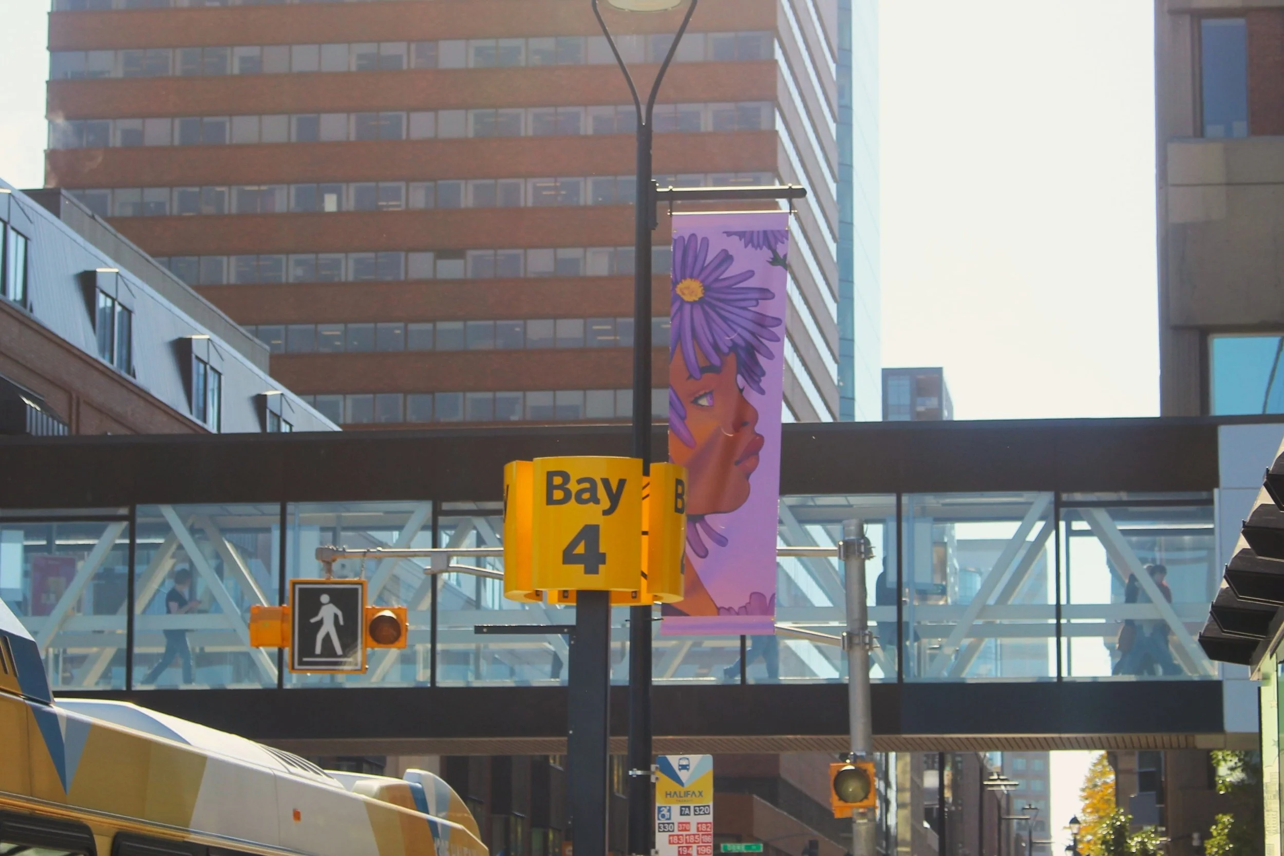
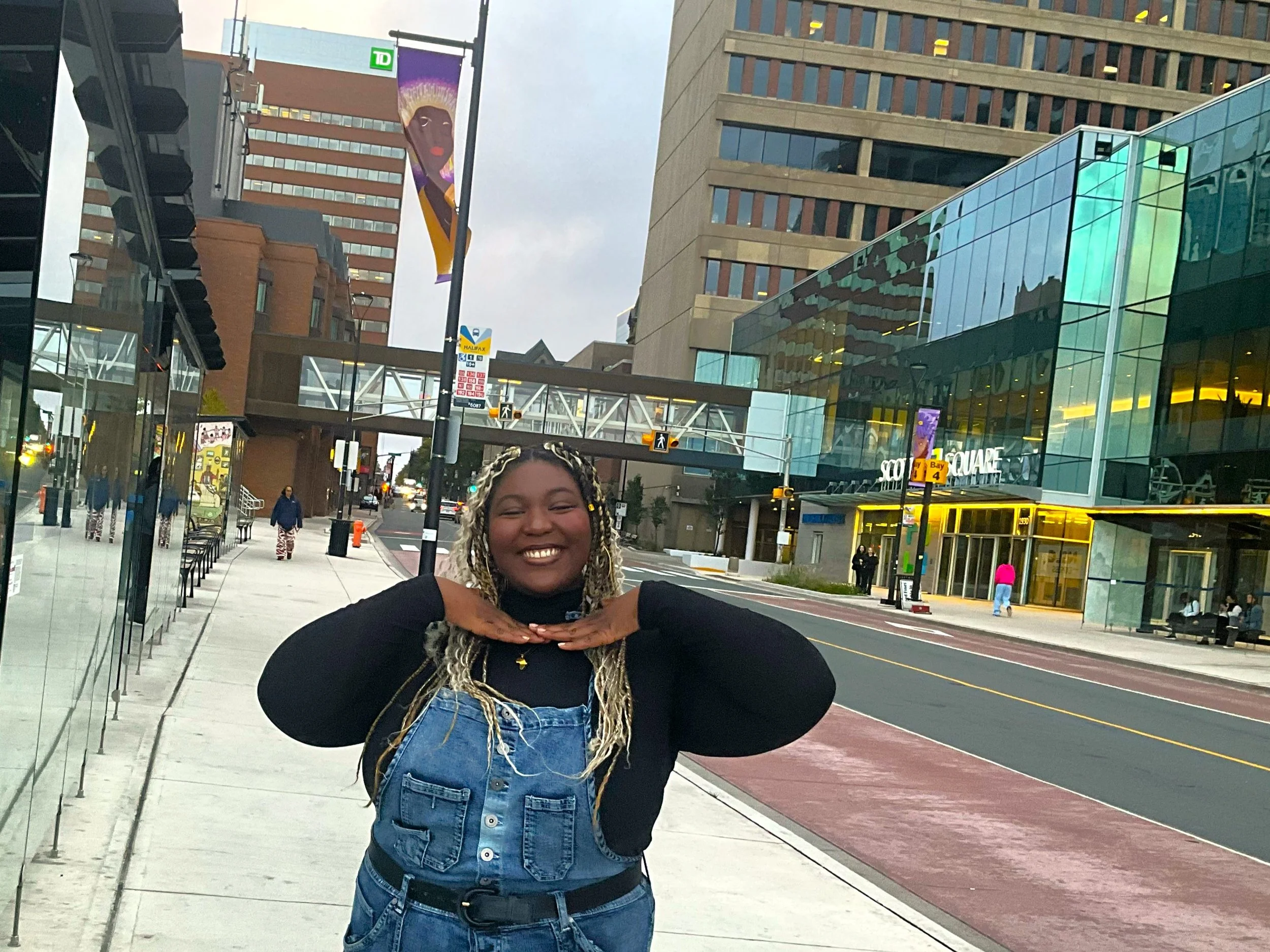
In Summer 2025, I was selected by a jury as one of the artists for InterCHANGE, a public art project run by IOTA Studios in partnership with Halifax Regional Municipality. My contribution involved creating 15 illustrated vinyl banners for display on light posts in the Cogswell District.
After the illustration phase, I was also hired to design the project’s logo and create didactic panels (informational signage) for the project identity.
Objectives & Theme
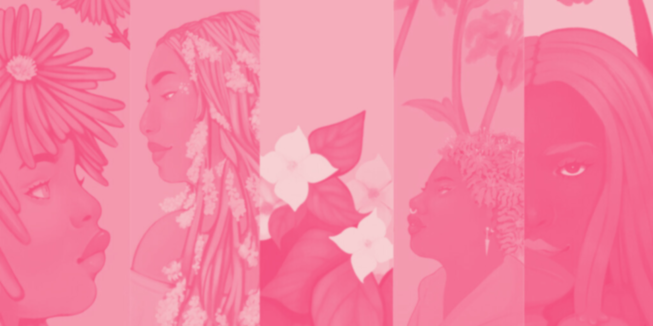
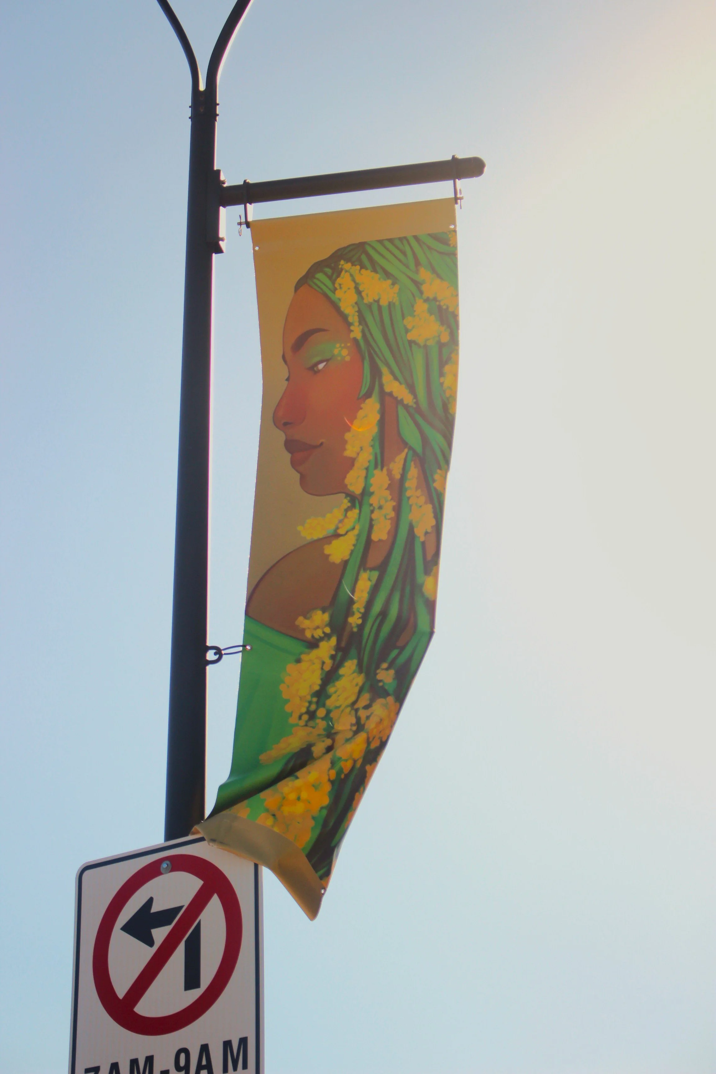
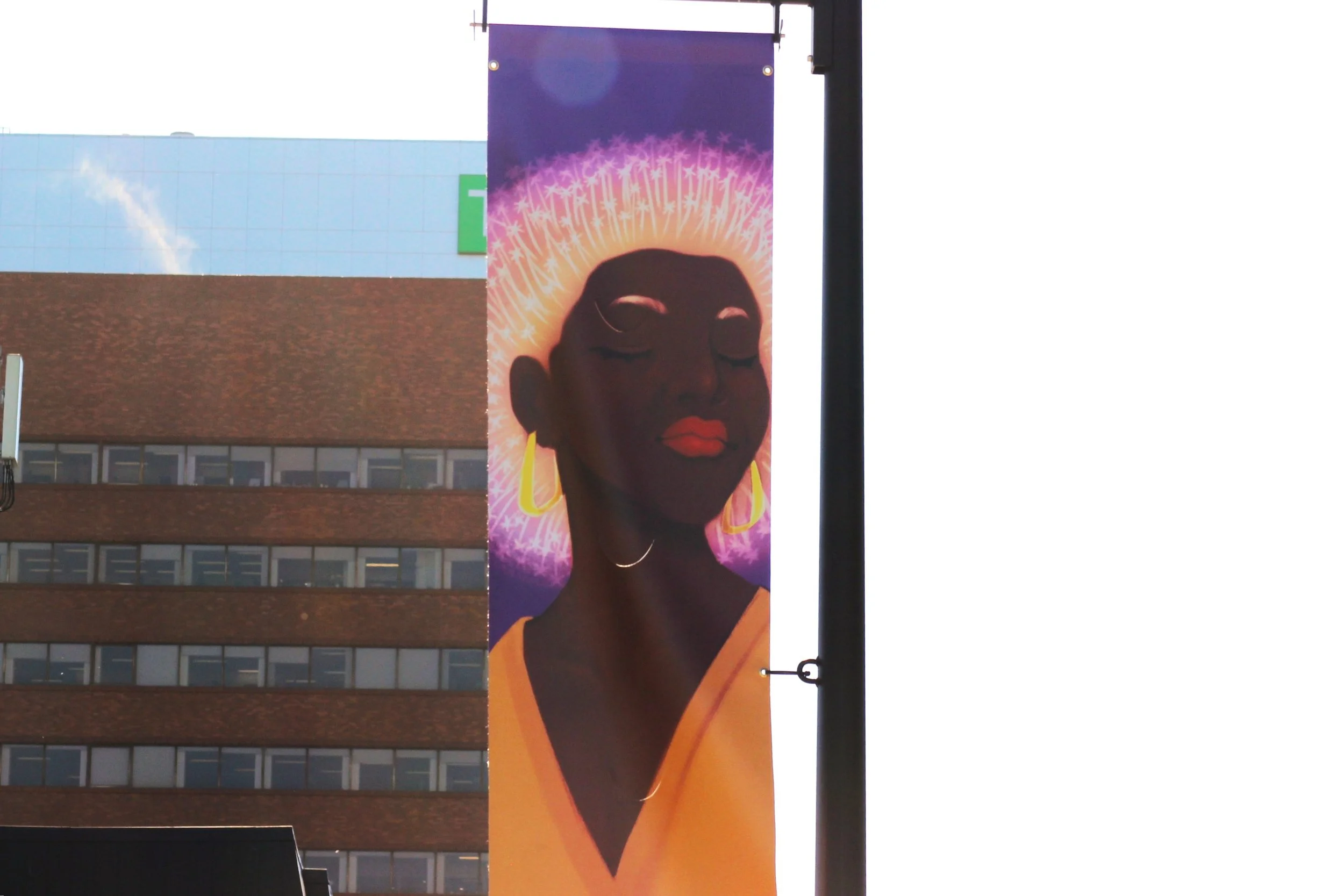
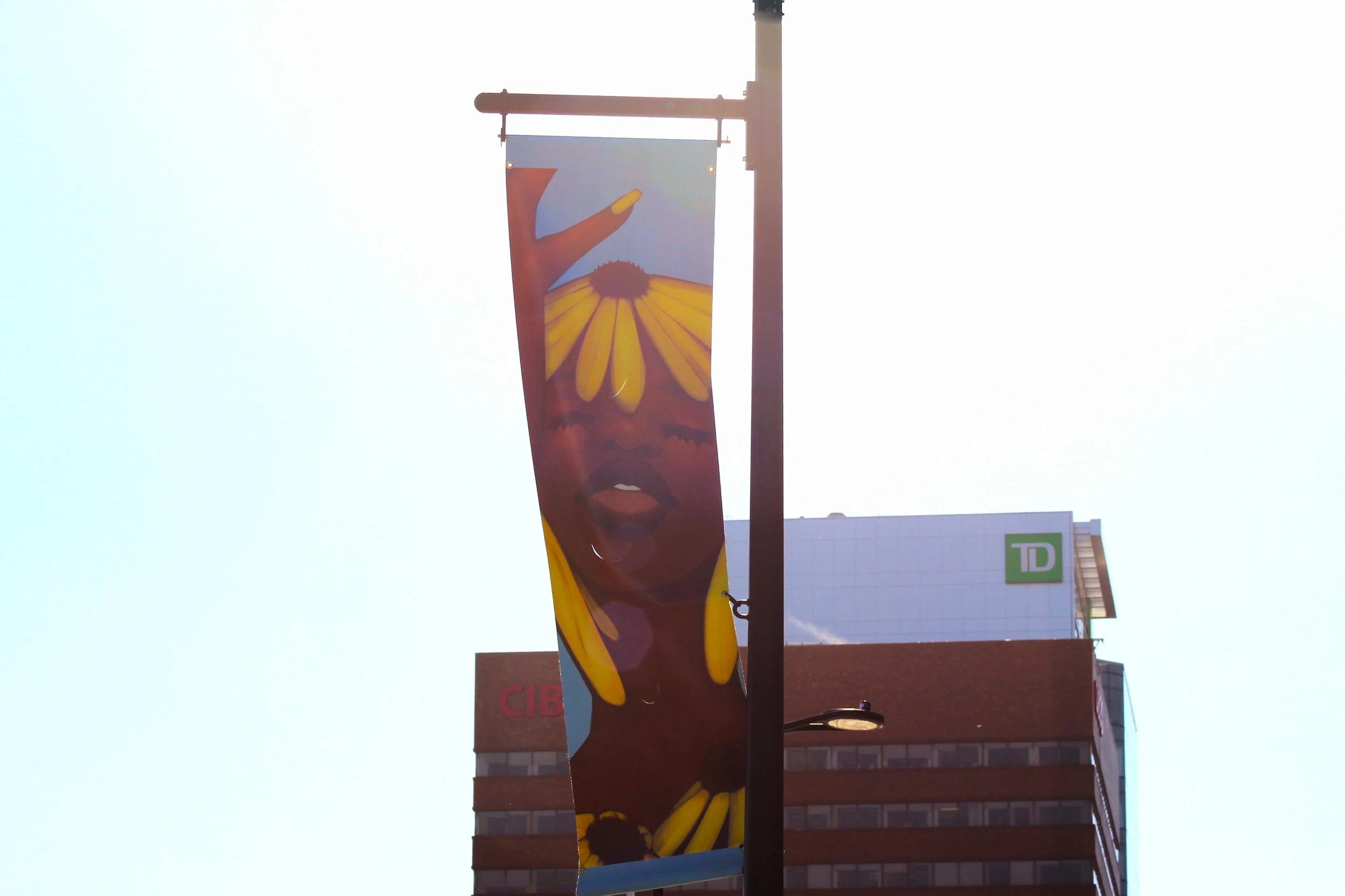
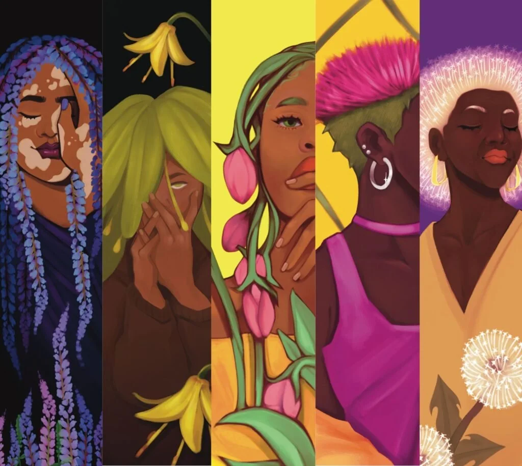
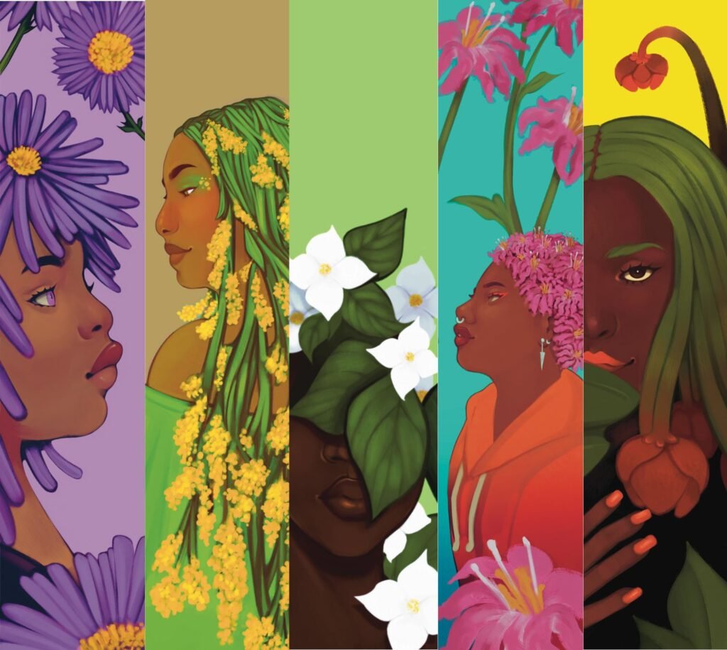
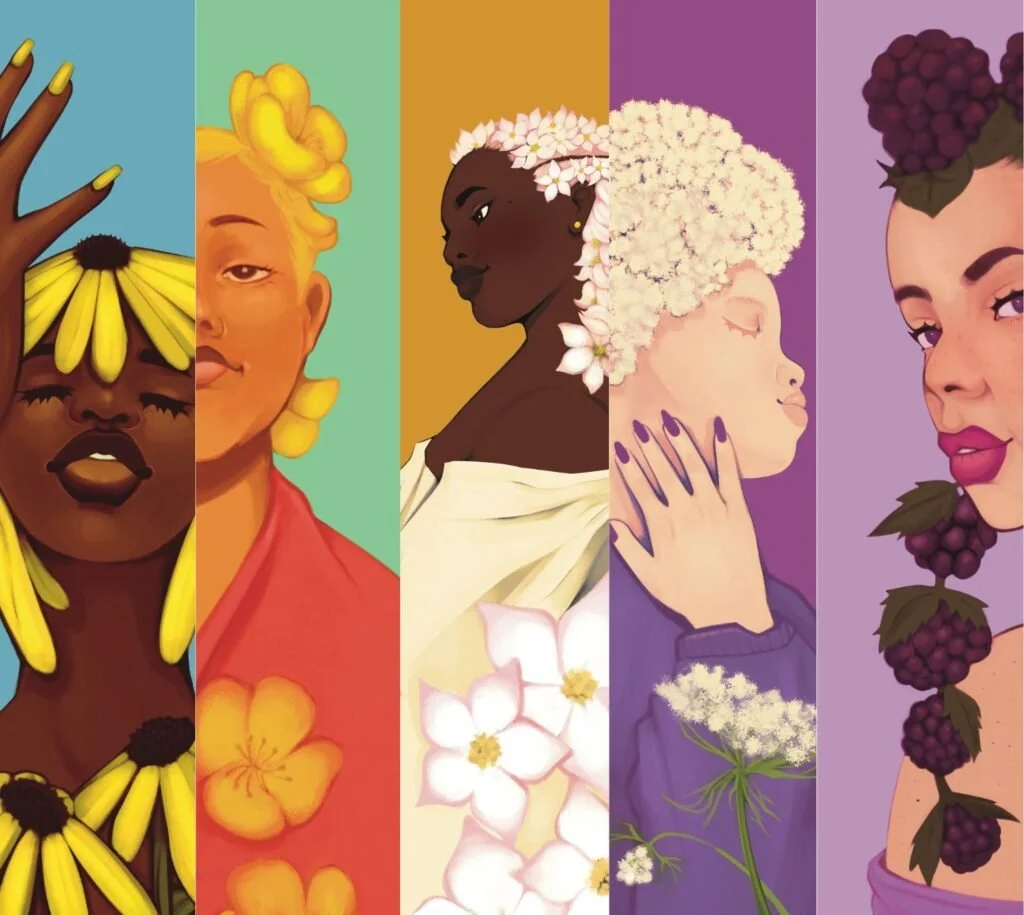
My vision for the project, entitled Homegrown, was to feature a variety of Black women whose hair is represented by different flora native to Nova Scotia. Each of the 15 pieces would be digitally painted, showing variations of faces, poses, and hairstyles. The theme Identity & Self-Love sought to highlight the beauty of natural Black hair, which has long been politicized, scrutinized, and discriminated against.
Growing up across the HRM, I have memories of lady slippers in East Preston, buttercups in Point Pleasant Park, lupine along the highways, and dandelions in Fairview fields. By combining these flowers and foliage with natural Black hairstyles like afros, locs, and braids, my goal was to convey the beauty and resilience of the Black community, while also showing that our roots in Nova Scotia run just as deep as everyone else’s.

Illustration Process

Submitted a design proposal with loose sketches describing the theme, artistic approach, and significance.

Refined 15 sketches into detailed compositions for approval.

Created the final 15 digital illustrations of Black women’s portraits with distinctive flora as hair, ensuring CMYK colour accuracy for large-format print, balancing detail with street level composition , and delivering high-resolution PDFs at the final production size for printing.

For the graphic design phase, I met with the InterCHANGE team to discuss the project identity. They wanted a logo that was fun, colourful, and clearly recognizable as an art project, something that would contrast with downtown Halifax’s neutral palette and avoid looking like construction signage.
Graphic Design Process

I presented four initial logo concepts.

Once the team selected the arrow-based design, I refined it and made various orientations.

I then developed a bright colour palette that met their criteria.

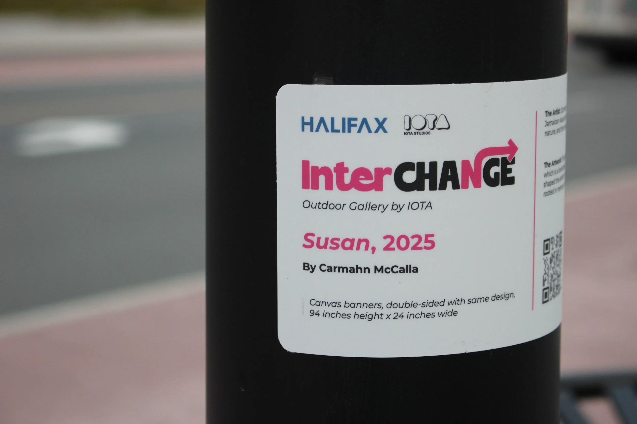
And created a didactic panel layout, to be printed on the poles for the public artworks.
An example of a didactic panel in use.