

It Takes A Village: Community Outreach & Advocacy
UX/UI Redesign • Web Development
Role
Timeline
UX Audit, Information Architecture, UI Design, Web Development
Tools
January - March 2026
Client
Figma, Wix
It Takes a Village Community Outreach & Advocacy
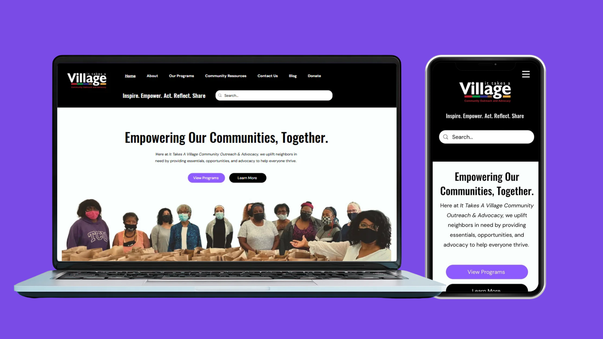
ITAVCOA provides community programs, outreach initiatives, and resources for individuals and families across Nova Scotia. However, its existing website presented challenges in how information was organized and accessed.
The redesign focused on improving the experience for visitors looking to understand the organization's work, explore programs, and locate community support.
Live Project
itavcoa.com
01: The Challenge
01 - Confusing Information Architecture
Programs, organizational initiatives, and external community resources were not clearly distinguished, making it harder for visitors to identify relevant information.
02 - Inconsistent Content Hierarchy
Important information was often presented in dense layouts with limited visual distinction between headings, descriptions, and actions.
03 - Accessibility Barriers
Some information was embedded in images, while inconsistent headings and navigation structures created additional barriers to accessing content.
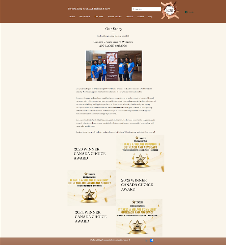
Original Homepage
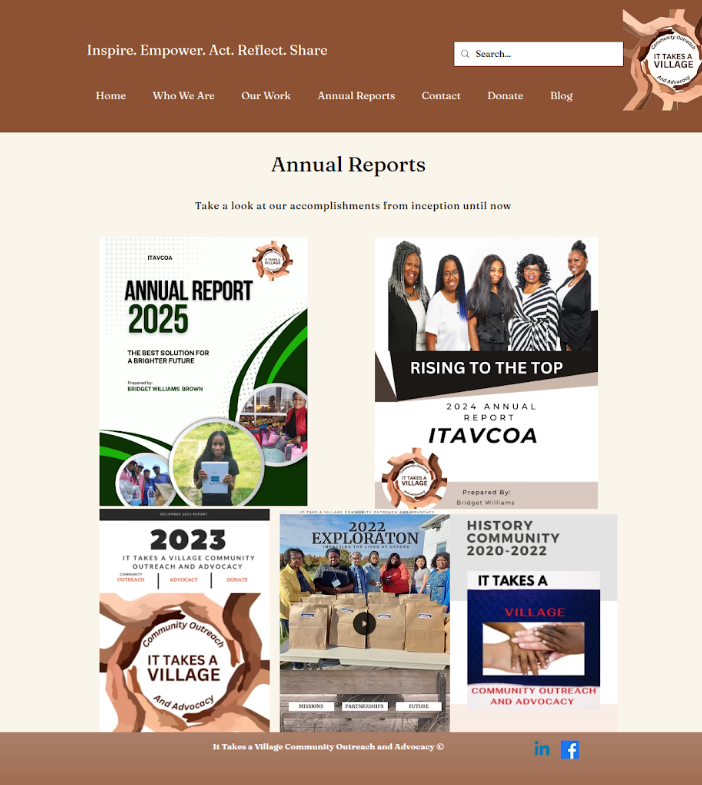
Original Annual Reports Page
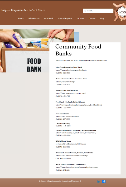
Original Food Banks Page
02: Auditing the Experience
Before redesigning the website, I reviewed its existing navigation, page structures, and content to identify opportunities to improve usability and accessibility.
The audit highlighted several recurring issues:
| Issue | Design Response |
|---|---|
| Navigation categories lacked clear distinctions | Reorganize pages around visitor needs |
| Important content appeared in images | Convert information into accessible webpage text |
| Inconsistent headings and layouts | Establish clearer content hierarchy |
| Page names and URL structures were inconsistent | Align navigation labels and page destinations |
| Annual reports lacked a consistent structure | Introduce reusable document cards |
| Limited footer navigation | Improve access to supporting pages |
03: Information Architecture
The original website contained a broad range of information, including organizational programs, community initiatives, annual reports, and external support resources. I mapped the existing website structure and developed a revised sitemap that grouped related information into clearer categories.
A key decision was separating ITAVCOA's own programs from external community resources.
This change helped establish clearer pathways for visitors looking to participate in an ITAVCOA initiative versus those seeking support from another organization.
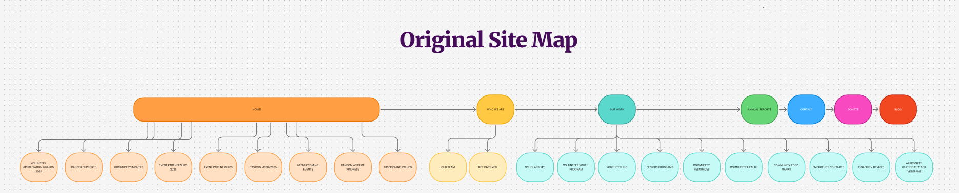
Original website structure showing the distribution of pages and content.
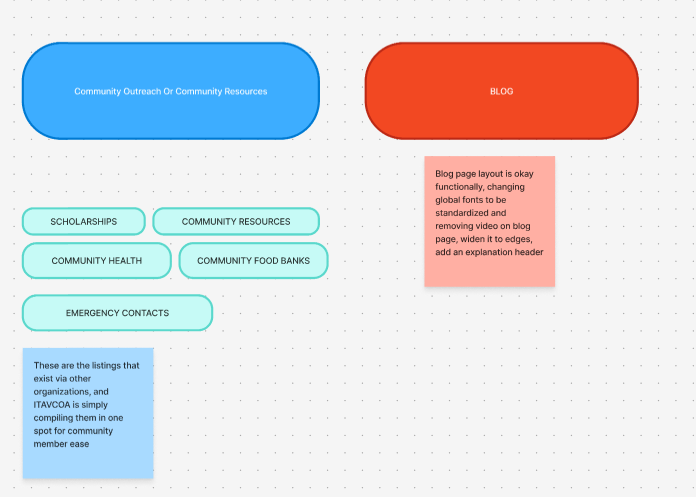
Exploring new content groupings and identifying relationships between pages.
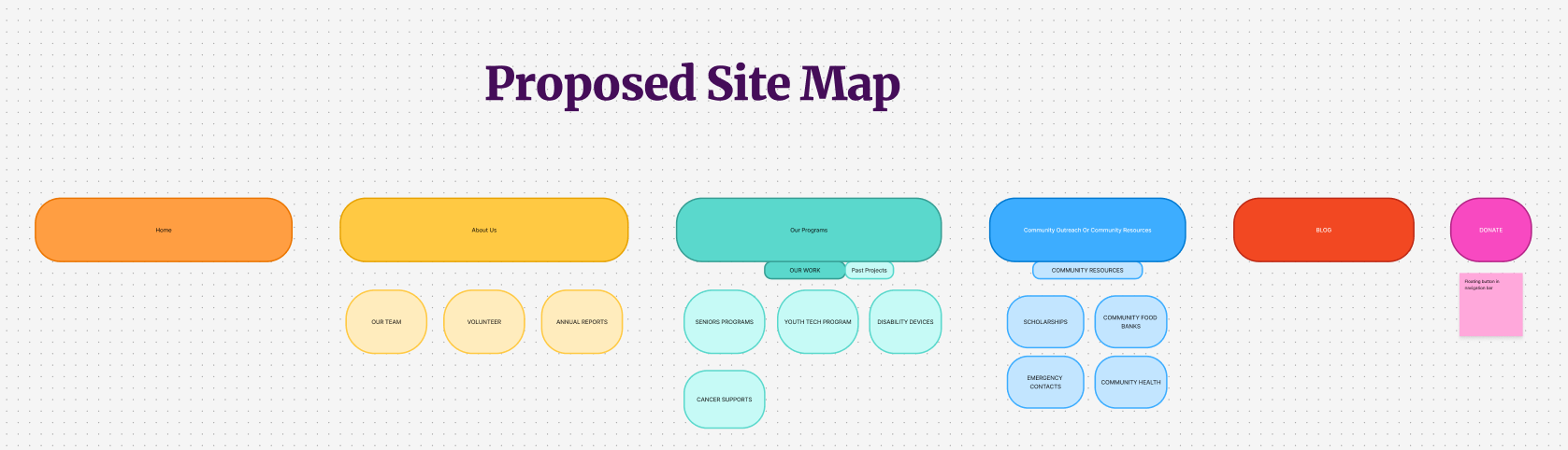
Revised information architecture separating programs, community resources, and organizational information.
04. Wireframes
With the revised sitemap approved, I developed desktop and mobile wireframes for each restructured page.
The wireframes established content hierarchy, navigation patterns, and responsive layouts before visual styling and implementation.
Different pages were structured around their primary purpose: introducing the organization, explaining programs, or helping visitors locate community resources.
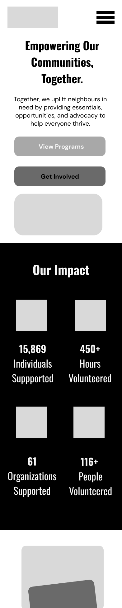
Homepage Mobile Wireframe
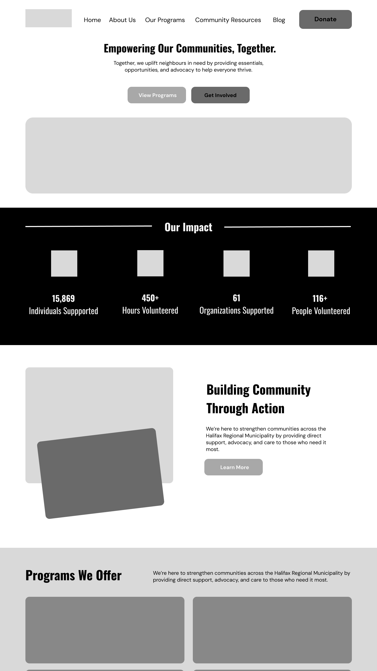
Homepage Desktop Wireframe
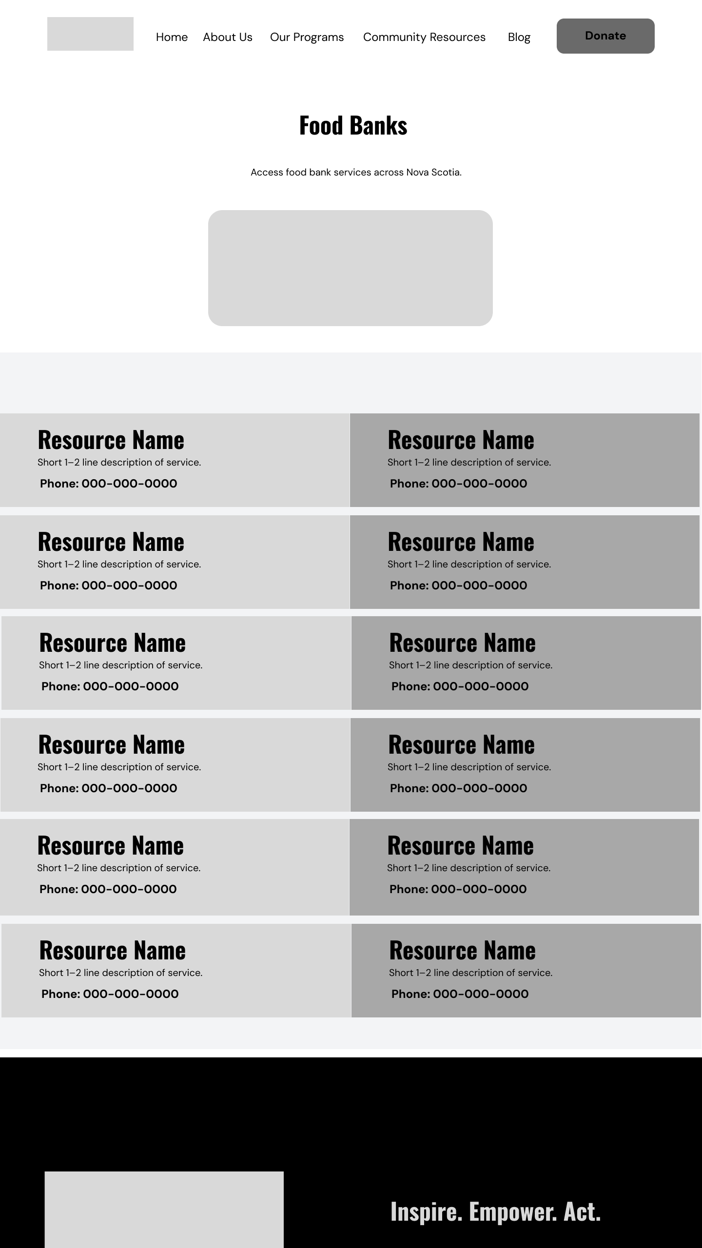
Food Banks Page Wireframes
05. Accesibility & Visual Design
The redesign introduced a consistent visual language using reusable components, clearer typography, and a defined colour palette.
Accessibility considerations informed both the structure and appearance of the website, including readable text, responsive layouts, heading hierarchy, and colour contrast.
Accessibility Design Decisions:
Converted image-based information into webpage text.
Improved heading hierarchy.
Reviewed colour combinations for contrast.
Designed responsive layouts.
Introduced consistent navigation and component patterns.
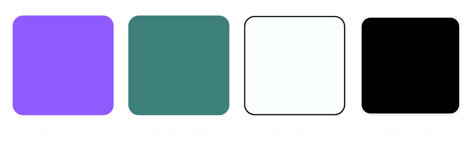
Color Palette
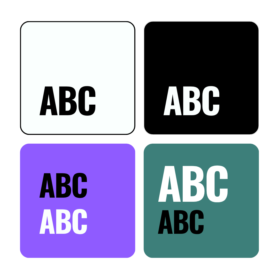
Color Palette with Contrast Considerations
06: Final Design
After getting approval for the sitemap and wireframes, I implemented the redesign in Wix. This involved rebuilding the page layouts, restructuring existing content, creating reusable visual patterns, and adapting the designs for desktop and mobile.
The completed website was launched with a revised navigation system, reorganized program and resource pages, and a more consistent presentation of organizational information.
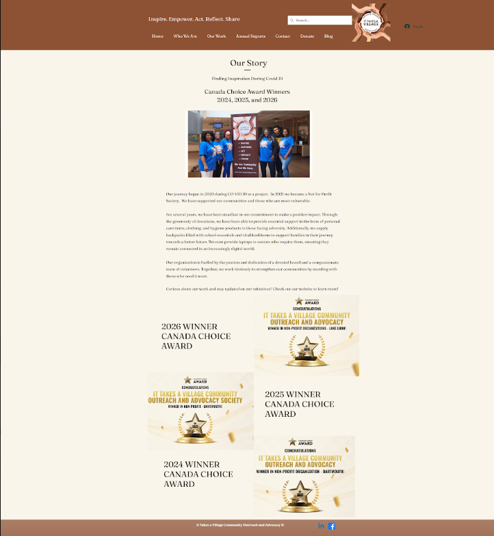
Before: An organization-focused homepage with lengthy text, prominent awards, and limited pathways to programs and resources.
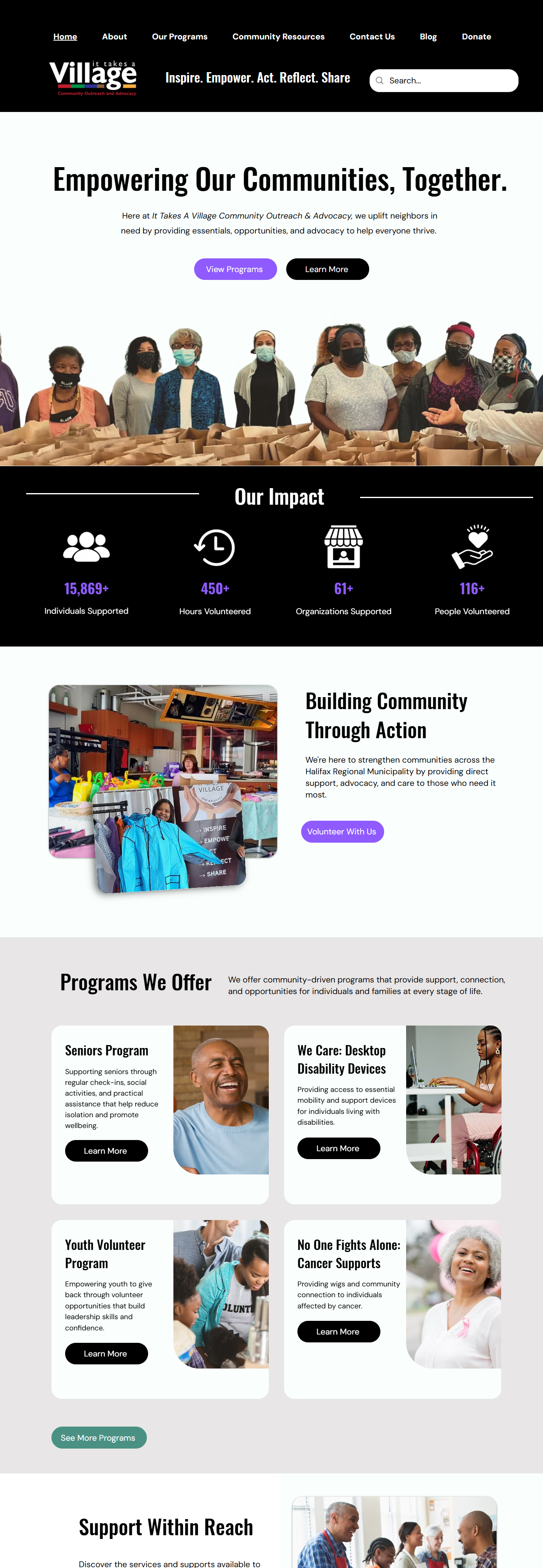
After: A visitor-focused homepage with clear messaging, highlighted community impact, and prominent calls to action guiding users toward programs and involvement.
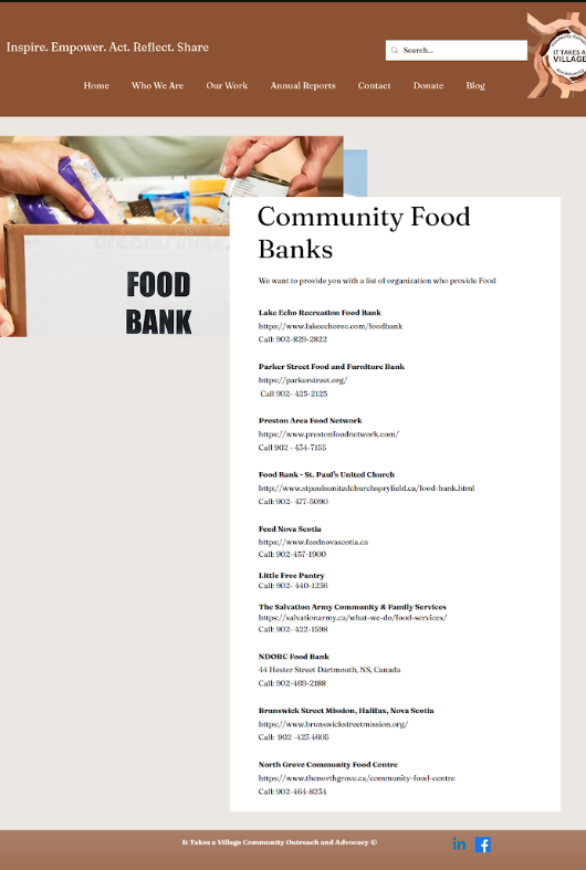
Before: Long, uninterrupted list of organizations and contact information.
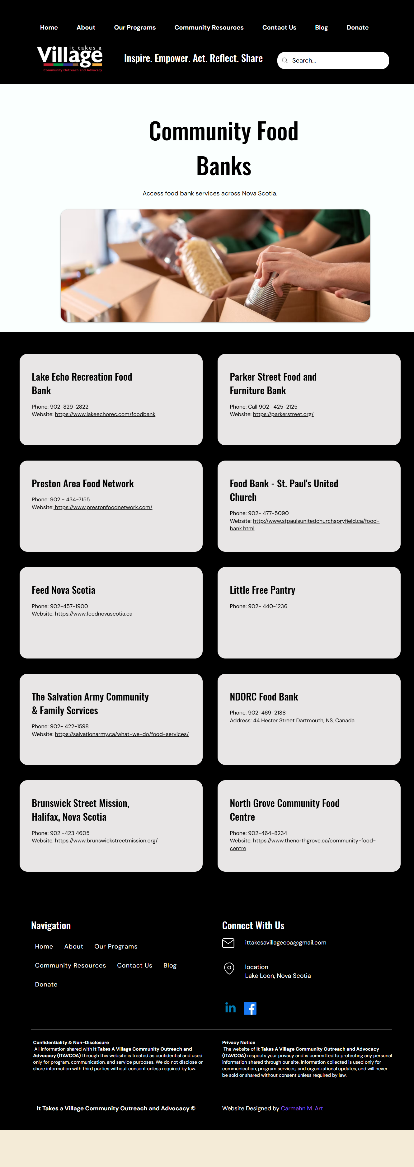
After: Individual resource cards with consistent information hierarchy and responsive layouts.
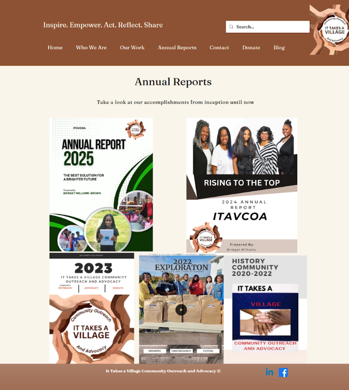
Before: Inconsistent arrangement of report covers with limited navigation cues.
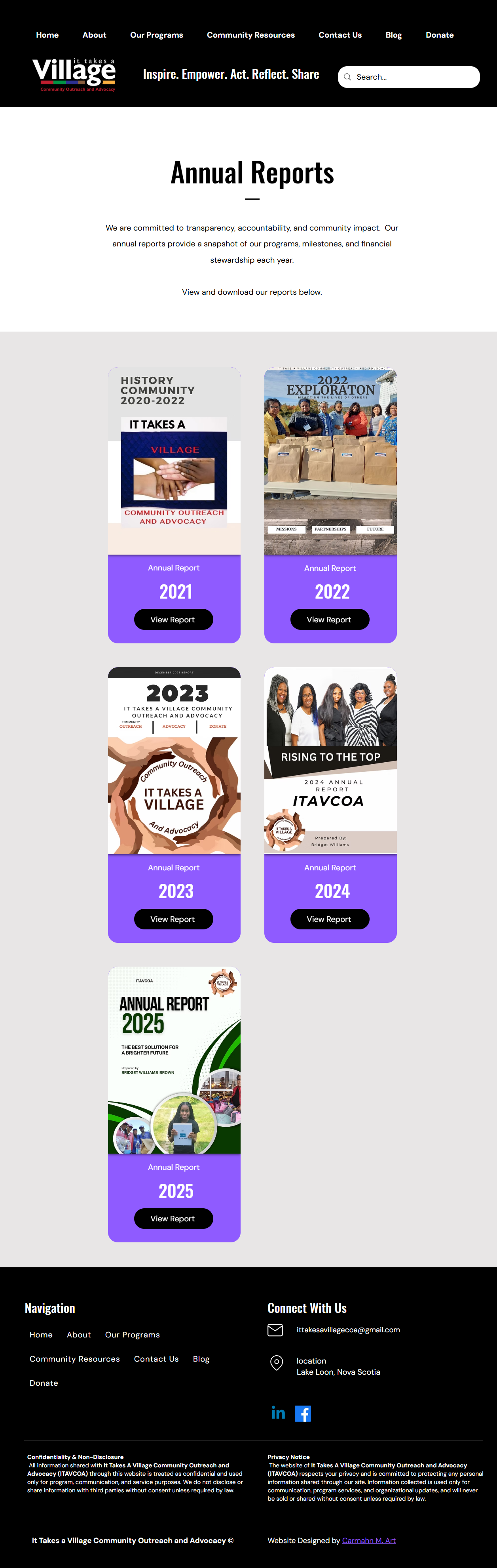
After: Reusable report cards organized by year, each with a clear action to view the publication.
07: Results & Key Takeaways
✓ Clearer navigation: Reorganized the sitemap to distinguish organizational programs, community resources, and supporting information.
✓ Improved accessibility: Introduced clearer heading hierarchies, readable web text, responsive layouts, and improved colour contrast.
✓ Streamlined content: Restructured existing information into consistent, scannable layouts, making programs, resources, and reports easier to browse.
✓ Scalable design: Established reusable page structures and components to accommodate future programs, publications, and community resources.
This project reinforced the importance of information architecture and accessibility in creating intuitive, community-focused websites. Managing the process from UX audit and wireframing to content restructuring and Wix implementation strengthened my ability to translate complex information into clear, functional digital experiences.