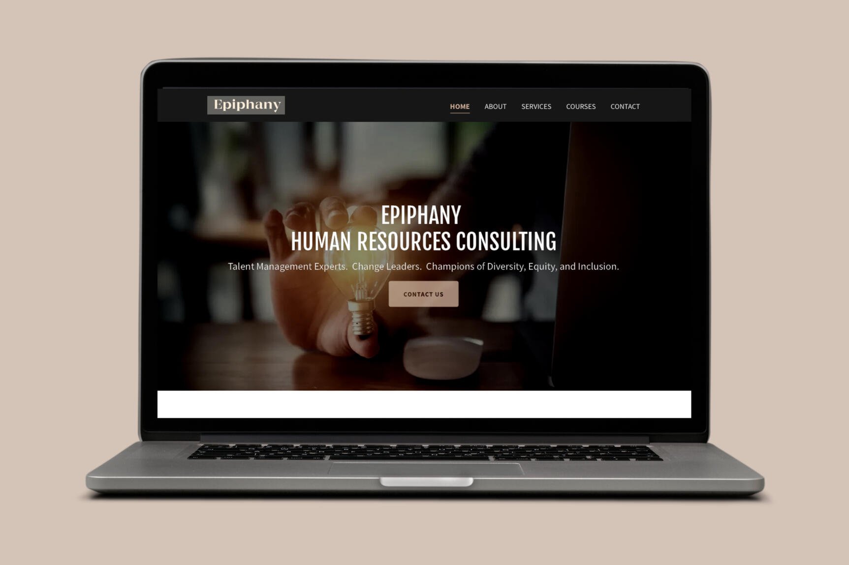
EPIPHANY HR CONSULTING
Tracy is the founder of Epiphany HR Consuting, is a seasoned human resources leader, educator and coach with more than 25 years of professional experience across private and public sectors.
She has requested a multi-page brochure website to improve her SEO standing and company branding.
Role
UX Research, UI Design
Live Project
epiphanyhr.ca
Client
Epiphany HR Consulting
Timeline
Dec 2023 - Feb 2024
Problem Statement:
Tracy previously had all of the information on a single homepage of her website. As her business grew, Tracy realized that she wanted to redesign and organize the layout of her website to better serve her clients.
Solution:
After discussing what her goals were, the website would include the following changes:
Breaking up the sections into separate pages
Establishing a consistent color palette
Optimizing sections for SEO
Creating a sitemap
Formatting the text and images to be more consistent
Project Role:
I was the sole designer and developer on this project, and I worked with Tracy to understand what changes she believed would help improve her website navigation for current and future clients. The tools/resources used for this project are listed below:
User Research & Information Architecture
Using research online and a compiled list of Human Resources companies and their websites, I gathered keywords to see which are used most frequently, and would better support higher/more accurate results in a search engine. The results of this list were then added into the site copy to improve SEO standing.
Images on the site were given descriptive but brief alt text, which serves accessibility and indexing purposes. The headings levels were recategorized for the same reasons.
Initially the site had all of the content on one page, which made indexing difficult. The sitemap was created to organize similar content grouped together, which allows for better indexing for search engines. The page URLs have been made concise for similar reasons.
Interface Design
The fonts chosen were Fjalla One for section titles and headers, and Source Sans for body and link text.
Images were a combination of a few existing ones, plus newly sourced ones that were all editied to fit a warmer tone, which also matched the color palette (black, white, and the accent color #CFAD97).
After sketching out different element layouts and reviewing common design styles for websites of this type, I compiled all of my notes into this sketch composite of each of the 5 main pages.
Wireframes
Using the content from the original homepage, I reorganized the sections into their own pages. Referencing the sketch, I started with a low-fidelity mockup, focusing on the page layout. It was important to keep the text well-spaced and readable, as an issue in the original website was that the text was too closely spaced together, and there was no clear visual hierarchy. I remedied this with large headings, short text descriptions for the sections, and labelling buttons.
Next, I made a medium/high fidelity prototype, implementing the chosen color and typefaces and rearranging content from the initial layout.
The final homepage is based on the medium prototype with minor layout changes.
Original Homepage
Low Fidelity Wireframe
Med Fidelity Wireframe
Final Homepage


