

Epiphany HR Consulting
UX/UI Design • Web Development
Role
Timeline
UI/UX Design, Web Development
Tools
Dec 2023 - Feb 2024
Client
Figma, Google Suite, GoDaddy
Epiphany HR Consulting

Epiphany HR’s founder, Tracy, initially had all of her business information on a single homepage. As her client base expanded, this layout became difficult to navigate and limited search visibility. The goal was to restructure and redesign the website to improve usability, readability, and SEO performance.
Live Project
epiphanyhr.ca
The original one-page design caused several challenges:
Poor navigation: Clients had to scroll extensively to find information.
Inconsistent formatting: Text and images lacked hierarchy and alignment.
Problem Statement
Low SEO ranking: Single-page structure limited keyword visibility and proper indexing.
Weak visual branding: No consistent color palette or typographic system.
I collaborated directly with the client to define her goals and target audience. My process involved the following.

01. Research & Competitive Analysis
Studied HR consultancy sites to identify industry trends, visual patterns, and SEO keywords.
Integrated high-frequency keywords into copy for stronger visibility.
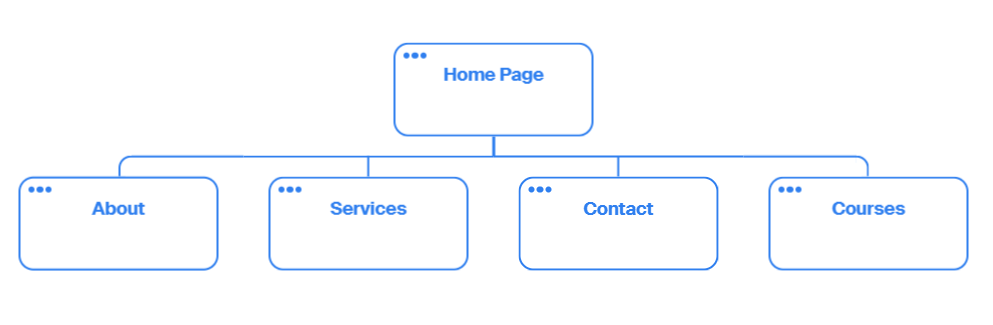
02. Information Architecture
Created a sitemap dividing services, about, and contact into separate pages.
Structured content flow to improve scanning and indexing.

03. Design System
Established a cohesive color palette and typography (Fjalla One + Source Sans).
Ensured accessibility with alt text, consistent imagery, and clear heading hierarchy.

04. Wireframes & Prototyping
Started with sketches → low-fi wireframes → mid/high-fi prototypes.
Refined spacing, hierarchy, and button labeling for clarity.

Original Website

Low Fidelity Wireframe
High Fidelity Wireframe

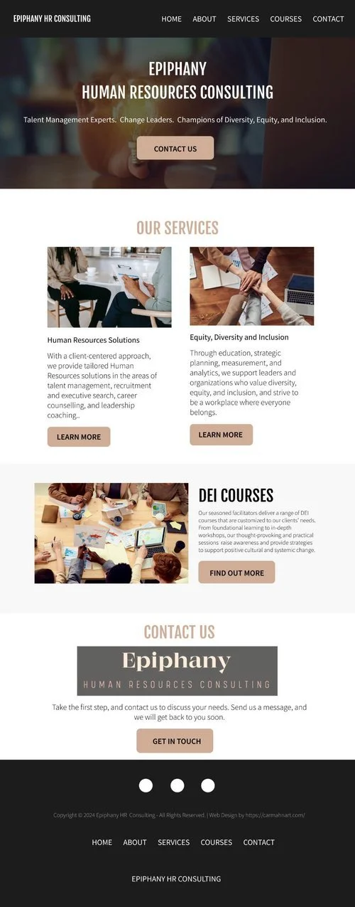
Final Home Page
05. Solution
The new design introduced:
A multi-page structure with clear navigation.
A professional and cohesive visual identity.
Optimized metadata, headings, and alt text for improved SEO and accessibility.
Readable, well-structured layouts with visual hierarchy and consistent formatting.

Results & Key Takeaways
✔ Improved usability: Clients can now easily navigate to relevant pages without scrolling fatigue.
✔ Enhanced discoverability: The new sitemap and SEO optimizations increased search accuracy and indexing potential.
✔ Consistent branding: Unified fonts, color palette, and image treatments strengthened brand identity.
✔ Scalable structure: The site can now grow as new services or team members are added.
This project reinforced the importance of information architecture and visual hierarchy in transforming a single-page site into an intuitive, search-optimized experience. Working solo across research, design, and development helped refine my ability to deliver full-cycle web solutions that balance business goals with user needs.